- Home
-
Production-Ready Responsive Navigation
Production-Ready Responsive Navigation
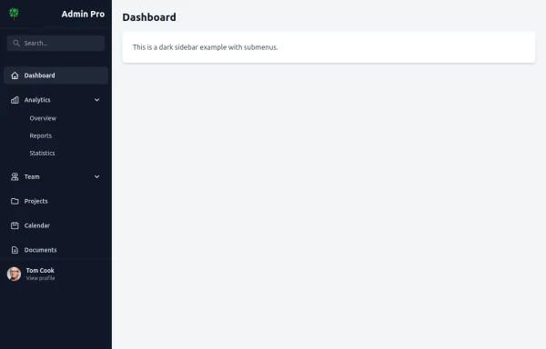
This is a sample content area. Scroll down to see the fixed header in action.
This tailwind example is contributed by zobaidul kaziex, on 17-Jul-2024. Component is made with Tailwind CSS v3. It is responsive.
Author zobaidul kaziex
Related Examples
-
Responsive Navbar
Tailwind Navbar
2 years ago8k -
New Nav Component
A new navigation component
1 year ago3.5k -
Navbar
E-commerce Navbar
1 year ago4.9k -
Tailwind Header
responsive mobile menu with a smooth transition
1 year ago3.8k -
1 year ago2.6k
-
1 year ago1.8k
-
1 year ago2.2k
-
1 year ago2.8k
-
1 year ago1.5k
-
1 year ago5.5k
-
1 year ago2.2k
Explore components by Tags
Didn't find component you were looking for?
Search from 3000+ components
