HTMLCODE
123
This tailwind example is contributed by Anonymous, on 22-Jun-2025. Component is made with Tailwind CSS v3. It is responsive.

Author Anonymous
Related Examples
-
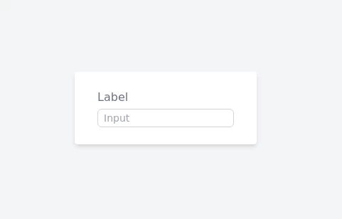 Serious Input Html
Input text serious like apple or smth
1 year ago2.5k -
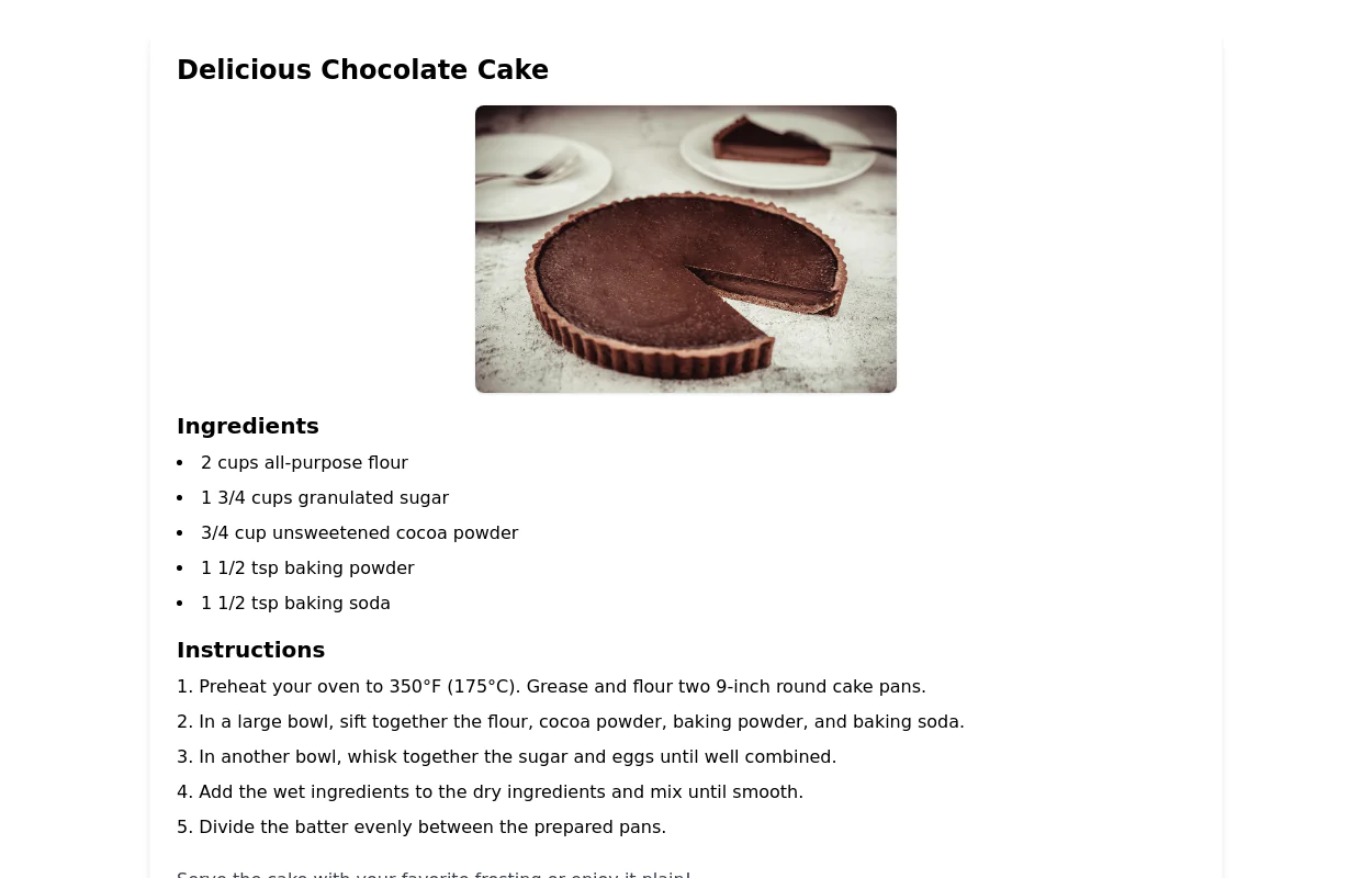 Recipe Card
beautiful recipe component with image and step-by-step instructions
2 years ago7.6k -
 joker
jokerjoker cyber punk
9 months ago1.3k -
 2 years ago28k
 -
 authentication form terminal
authentication form with zsh on mac terminal looks
1 year ago3.1k -
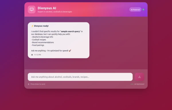
 Ai clone, chat ui
Chat interface for ai builder, dont toomuch focused on designing responsive
1 year ago2.3k -
 Sign up
sign up page
10 months ago1.4k -
 Maintenance page template
The site is under maintenance placeholder page
2 years ago10.7k -
 5 months ago273
 -
 5 months ago605
 -
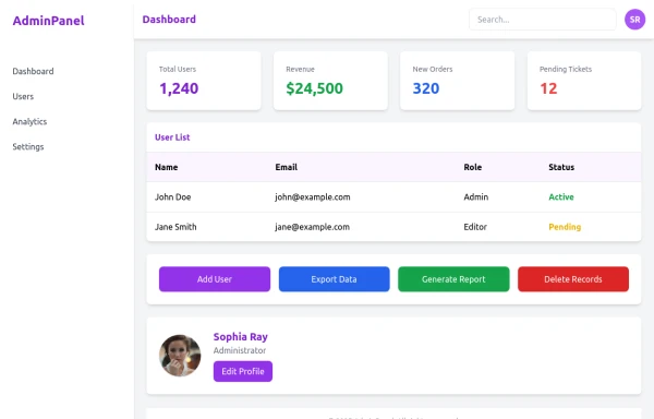 admin panel UI
Premium Admin Panel Pack including sidebar navigation, top navbar, dashboard cards, user tables, quick actions, profile section, and footer. Fully responsive with modern clean design using Tailwind CSS.
9 months ago1.9k -
 Lots of button examples
tailwind button examples
10 months ago605


Explore components by Tags
Didn't find component you were looking for?
Search from 3000+ components