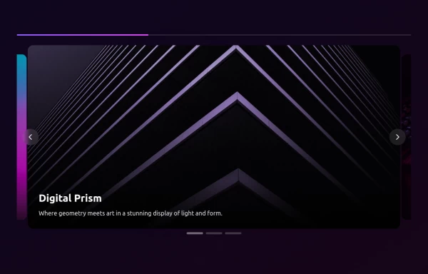
Nice and simple carousel
Nice and simple carousel, fully responsive.
This tailwind example is contributed by dev cheick, on 11-Aug-2024. Component is made with Tailwind CSS v3. It is responsive.

Author dev cheick
Related Examples
-
 11 months ago1.8k
 -
 Premium High-Performance Web Gaming Hub
Experience the future of browser-based gaming. I’ve developed a premium arcade hub designed for speed, clarity, and zero-latency gameplay. Built with modern web technologies, Ayyamperumal Games brings AAA-inspired visuals and high-octane mechanics directly to your browser—no downloads, no lag, just pure performance. Explore a curated library of titles ranging from minimalist logic puzzles like Sudoku Elite to fast-paced action in Neon Drift. This is where clean code meets high-level entertainment.
2 months ago433 -
 3D Animated Image Gallery
3D Animated Image Gallery
1 year ago9k -
 Linear dinamique section by Raul antonio de la cruz hernandez remix omerlinx responsive
Linear dinamique section by Raul antonio de la cruz hernandez remix omerlinx responsive
2 months ago216 -
 How to create a carousel with Tailwind CSS and Alpinejs
How to create a carousel with Tailwind CSS and Alpinejs
1 year ago3.9k -
 Carousel Card Slider Swiper on Alpine.JS
with support drag and drop mouse actions
1 year ago13.4k -
 2 years ago7.3k
 -
 1 year ago7k
 -
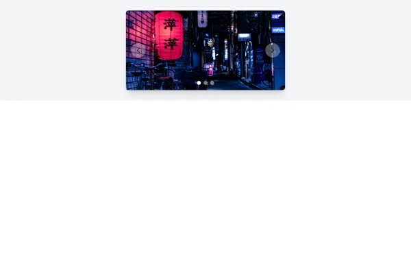 Simple Animated Carousel
A simple, animated 2:1 carousel with touch swipe support, based on perky98/Juraj's carousel.
10 months ago1.3k -
 1 year ago3.2k
 -
 Slider
Responsive slider
1 year ago2.6k -
 Our services
Component: Interactive Services Carousel Overview: A card-based carousel built with HTML5 and Tailwind CSS, powered by Vanilla JavaScript. It displays Adeoar's 6 main services with a responsive layout and smooth transitions. Technical Features: Responsive: Displays 3 columns on desktop (md breakpoint) and 1 column on mobile devices. Dependencies: Tailwind CSS (CDN or compiled) + Native JavaScript (no external libraries like Swiper or Slick required). Icons: Inline SVG icons (Heroicons style). Functionalities: Navigation: Side buttons (prev/next) and bottom pagination (indicator dots). Automation: Autoplay runs every 4 seconds (infinite loop logic). Interaction: Autoplay pauses automatically on mouse hover (mouseenter/mouseleave). Style & Design (UX/UI): Default State: White background, soft shadows, pastel-colored icon backgrounds. Hover State (Active): Zoom Effect: The card scales up (scale-105). Color Inversion: Background changes to Navy Blue (bg-blue-900) and text turns white for high contrast. Details: The icon background turns white, and the icon stroke takes the dark blue color.
4 months ago453


Explore components by Tags
Didn't find component you were looking for?
Search from 3000+ components