Call to Action section for home page
This tailwind example is contributed by Sophia Baker, on 19-Jan-2023. Component is made with Tailwind CSS v3. It is responsive. similar terms for this example are CTA,banner

Author Sophia Baker
Related Examples
-
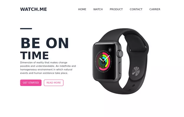 Product Page
Showcase for the product.
3 years ago33.3k -
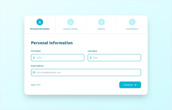 stepper
The Stepper Component is a versatile and user-friendly tool designed to guide users through a sequence of steps. Whether you're building a multi-step form, a tutorial, or any process that requires sequential navigation, this component makes it easy to implement and customize.
1 year ago2.1k -
 3 years ago12.1k
 -
 Blog post card
Responsive blog post or article card. This card can also be used as a CTA
2 years ago10.8k -
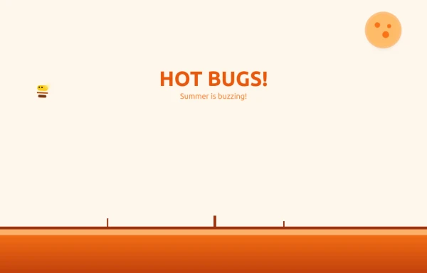 Bug Beach Day Heatwave
This playful animation brings sweltering summer insects to life with pure HTML and Tailwind CSS. Watch as: 🔥 Glowing Fireflies pulse with heat-radiant light, their wings shimmering in the desert sun 🐞 Overheated Ladybugs scuttle across cracked earth, their red shells reflecting the blazing heat ☀️ A Wobbling Sun dominates the sky, emitting pulsing heat waves across the animated landscape
9 months ago1.1k -
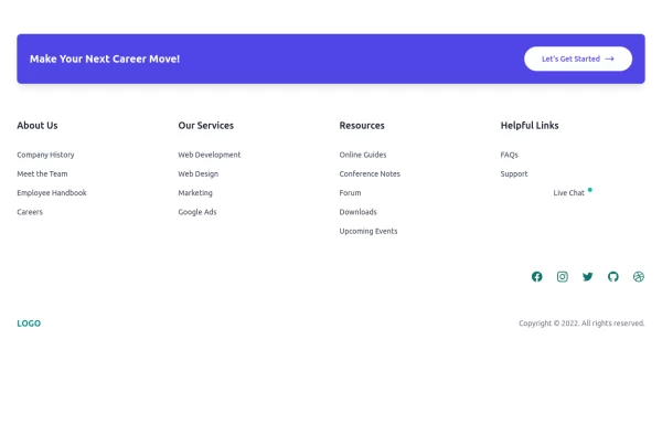 Clean & Responsive Footer Design with Tailwind CSS With CTA Button
modern and responsive footer built with Tailwind CSS to enhance website navigation, accessibility, and user experience. Featuring quick links, social media icons, copyright info, and a sleek layout, this SEO-friendly footer improves engagement and usability across all devices. Perfect for portfolios, business websites, and eCommerce stores!
11 months ago1.1k -
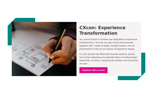
 Call to action card with image
Responsive card with image
2 years ago16.5k -
 Boost Your Business with a Stunning Website!
Take your online presence to the next level with a high-performing, visually captivating website. Let’s build something amazing together!
11 months ago1k -
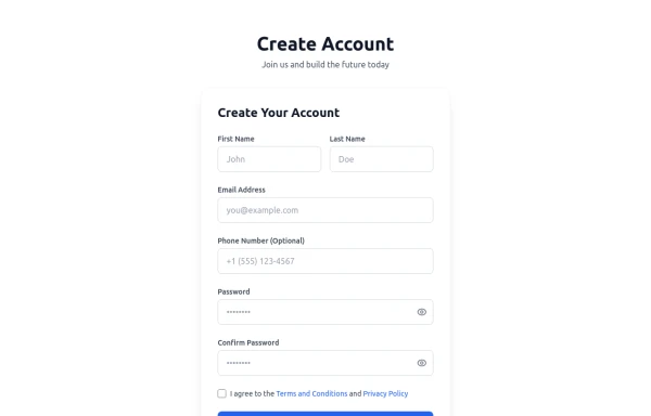 Registration Form with Validation & Success State
A modern and interactive registration form built using Tailwind CSS and Alpine.js, designed for seamless user onboarding with real-time validation and elegant animations. This component includes client-side form validation, dynamic password visibility toggles, and a success confirmation screen with personalized feedback. It’s fully responsive, dark mode–ready, and styled for modern SaaS or startup platforms. ✨ Key Features 🧠 Real-time input validation for required fields (name, email, password, etc.) 🔒 Show/hide password toggle with animated SVG icons ✅ Success message with user details after submission 💨 Animated transitions using Alpine.js 🌙 Dark mode and light mode compatible 📱 Fully responsive across all screen sizes 🧩 Built with pure Tailwind CSS and Alpine.js (no external libraries) 💡 Perfect for: Registration or sign-up pages SaaS onboarding flows Portfolio or agency login systems Form validation demos or UI component libraries
5 months ago295 -
 11 months ago710
 -
 Responsive Hero Section
Get this professional hero section for your website. Includes a gradient text effect, stylish background blurs, and a perfectly aligned image section. Easy to integrate and fully customizable for any project.
5 months ago272 -
 3 years ago13.6k


Explore components by Tags
Didn't find component you were looking for?
Search from 3000+ components