Boost Your Business with a Stunning Website!
Take your online presence to the next level with a high-performing, visually captivating website. Let’s build something amazing together!
This tailwind example is contributed by Vikas Kushwah, on 24-Mar-2025. Component is made with Tailwind CSS v3. It is responsive. similar terms for this example are CTA,banner

Author Vikas Kushwah
Related Examples
-
 2 years ago3.8k
 -
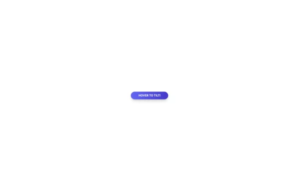 Tilted button on hover.
A simple button with a gradient and tilt on hover. Dark mode supported with same color.
11 months ago982 -
 The Future of Web Development
love my product
9 months ago906 -
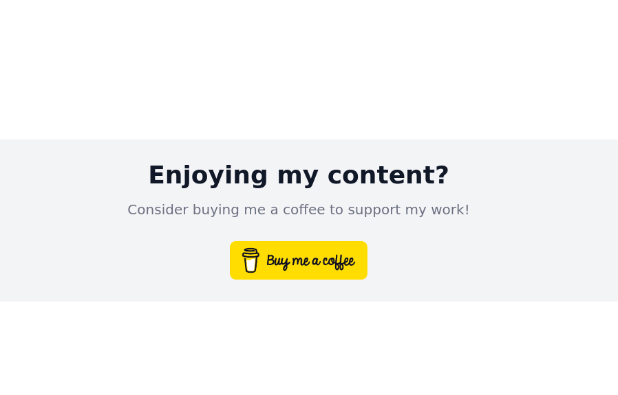
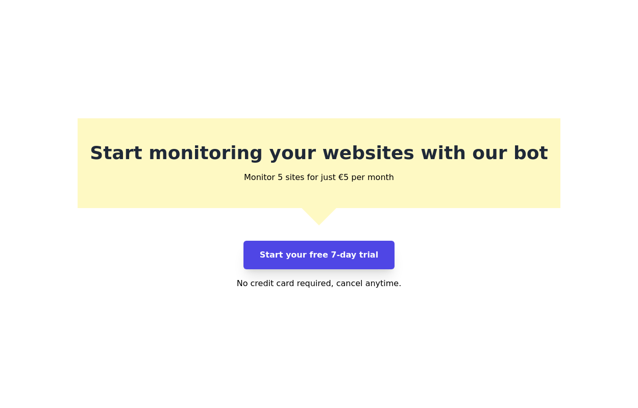 Call to action component
Start your free 7-day trial Call to action button
2 years ago8.1k -
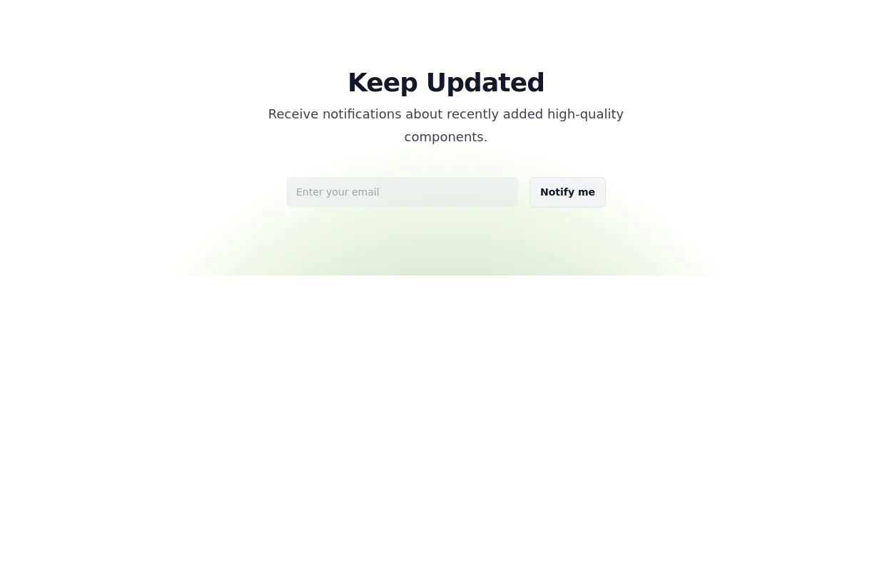 Newsletter Signup Form
It features a clean and modern design with a background illustration, making it visually appealing.
2 years ago8.1k -
 1 year ago2.3k
 -
 CTA card with gradient background
Grab users attention using this eye catching CTA card
2 years ago4k -
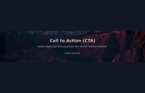 Call to Action (CTA with Background Image)
A Call to Action (CTA) is an essential element in marketing and web design that prompts users to take a specific desired action. When combined with a compelling background image, it can significantly enhance user engagement and conversion rates.
1 year ago2.8k -
 3 years ago10.1k
 -
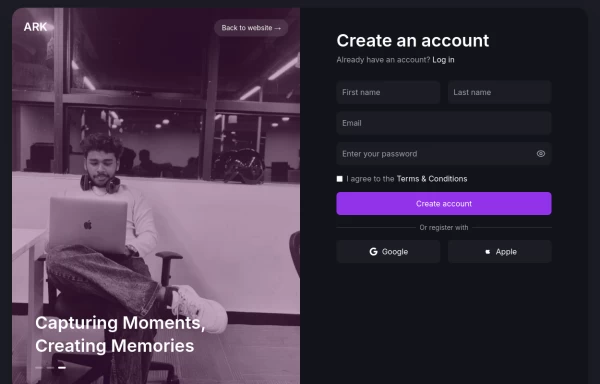 Login page
Login and register page, you can reuse both
1 year ago2k -
 Landing page hero section UI
Modern Hero Section Design
5 months ago774 -
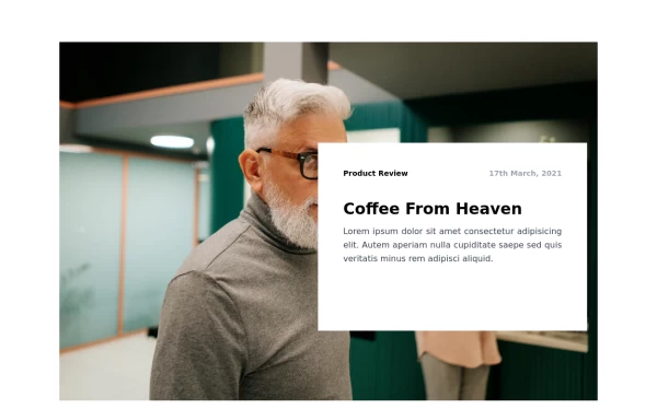
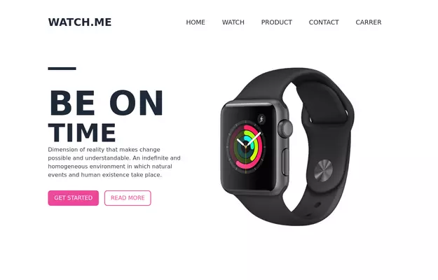 Product Page
Showcase for the product.
3 years ago33.1k


Explore components by Tags
Didn't find component you were looking for?
Search from 3000+ components