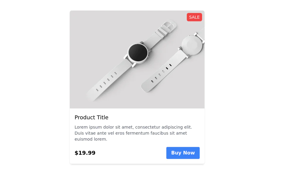
Product card
This tailwind example is contributed by Simon Scheffer, on 19-Dec-2022. Component is made with Tailwind v3.4. It is responsive. It supports dark mode. similar terms for this example are Product Showcase, Product card

Related Examples
-
 Product page
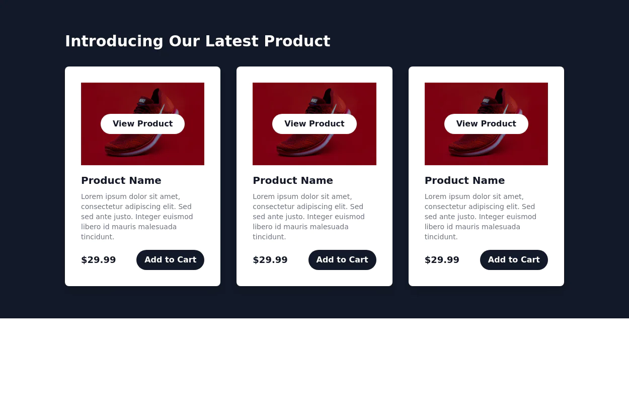
Product Information Card component that provides comprehensive details about a product, including an image, name, description, price, availability, color and size options, and a product description.
49.4k -
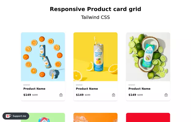 Responsive products grid
Responsive product card grid using tailwind CSS.
46.2k -

-
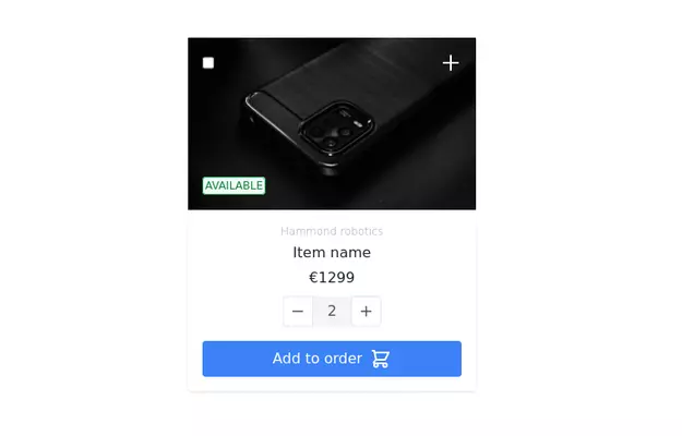
 Products card grid
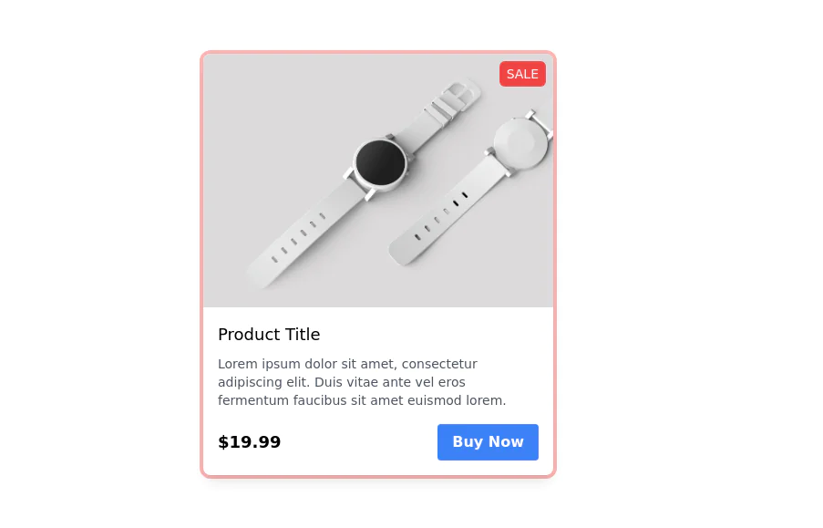
Example of product card grid with product image and pricing
24.9k -
 14.5k
-
-
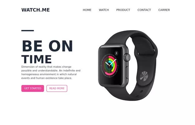 Product Page
Showcase for the product.
34.8k -
-
 10.8k
-
 24.2k
-
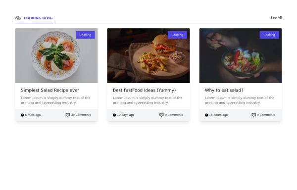 Card grid section
Display article/blog grid
31.3k -

-
-
 Card
Card with Likes and download Button
11.2k -
 18.3k
-
 Responsive card grid
responsive card grid for articles
16.6k -
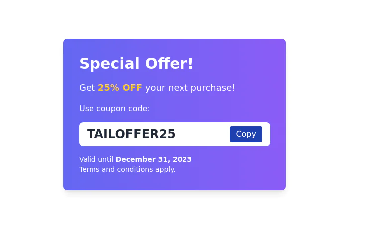 Coupon code card
Display Special Offer with Coupon Code
11.7k -
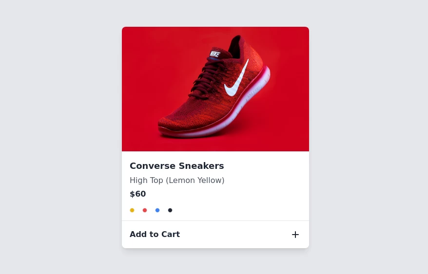 Product card
sleek and modern product card
7.5k


Browse by topic
Explore components by Tags
Jump straight to the UI pattern you need.
Can't find it?
Didn't find the component you were looking for?
Search across 3,000+ community-built components and grab the code in seconds.