Card
Card with Likes and download Button
This tailwind example is contributed by Mrunal Solkar, on 03-Sep-2023. Component is made with Tailwind CSS v3. It is responsive. It supports dark mode.

Author Mrunal Solkar
Related Examples
-
 3 years ago32.1k
 -
 3 years ago25.7k
 -
 3 years ago31.7k
 -
Glowing gradient button
Button on black background
3 years ago39.6k -
3 years ago32.4k
-
 Floating buttons examples
Bottom-Right Corner, Bottom-Left Corner, Top-Left Corner, Top-Right Corner, Center, Bottom-Center
2 years ago25.9k -
 2 years ago8.8k
 -
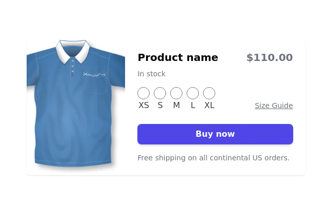
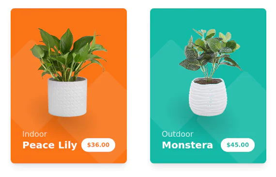
 Products card grid
Example of product card grid with product image and pricing
3 years ago24.2k -
 Products cards w/ hover effect
Example of product card grid with product image, pricing and a hover effect FORKED FROM: https://tailwindflex.com/noob_dev/products-card-grid
2 years ago19.5k -
 1 year ago2.4k
 -
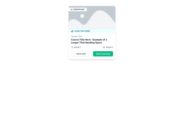 E-Learning Course Card with Badge and Level Indicator
An HTML and Tailwind CSS component mockup for displaying course information. Features include a placeholder image area with an overlaid certificate badge, a distinct level indicator banner below the image, category text, a course title, key details (like duration and learner count placeholders), and primary/secondary action buttons. Designed for e-learning platforms or course listings.
11 months ago1.1k -
 Image Card
An image. Shows title and description info when hovering. Image zooms and darkens when hovering.
10 months ago836


Explore components by Tags
Didn't find component you were looking for?
Search from 3000+ components