Floating Action Button
This component displays a fixed, floating contact button panel positioned at the bottom-right corner of the screen. It provides users with quick access to key communication channels including WhatsApp, Email, and Instagram. Each icon is styled with vibrant, platform-specific colors and includes subtle hover animations for an interactive user experience.
Ideal for improving accessibility and encouraging user engagement, especially on mobile devices.
This tailwind example is contributed by Arturo Lizana, on 06-Apr-2025. Component is made with Tailwind CSS v3. It is responsive. similar terms for this example are CTA,banner,Social media links,

Author Arturo Lizana
Related Examples
-
 Modern Dark Footer with Overlapping Gradient CTA
A comprehensive, dark-themed website footer component built with HTML and Tailwind CSS. It features a visually distinct overlapping section with a colorful gradient background containing a prominent call-to-action (CTA) block. The main footer area utilizes a multi-column grid layout for organized navigation links, a newsletter signup form, and social media icons. A final bottom bar includes legal links and copyright information. The design is responsive and adapts its layout for different screen sizes.
10 months ago1.1k -
 Tilted button on hover.
A simple button with a gradient and tilt on hover. Dark mode supported with same color.
1 year ago1.2k -
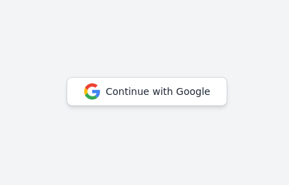 Continue with Google button
Login with google button for social login.
2 years ago24.6k -
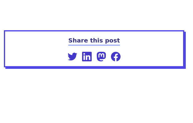
 Social Media Icon Buttons with Tooltips
A responsive and interactive social media icon component built with Tailwind CSS. This component features Facebook, Twitter, and Instagram icons with smooth hover effects and tooltips that display the platform name. The icons are styled with rounded edges, shadows, and scale-up effects on hover, making them visually appealing for social media integrations. Ideal for adding social links to any website or application.
1 year ago1.7k -
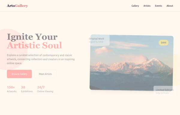 ArtoGallery
Explore a curated selection of contemporary and classic artwork, connecting collectors and creators in an inspiring online space.
9 months ago1.2k -
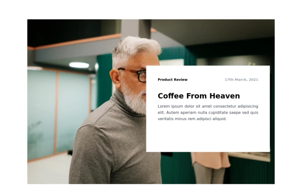
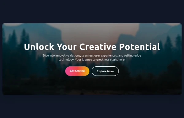 Hero Section
Responsive Hero Section for you Project Background Image: A stunning, high-quality Unsplash photo that creates a unique visual impact. Overlay: Semi-transparent black overlay with blur effect for readability and a modern aesthetic. Content Area: Centered with a gradient background overlay for contrast, bold headline, engaging subtext. Buttons: Vibrant gradient and clean border with smooth hover animations to draw attention. Responsive Design: Looks great on all screen sizes with adaptable padding and font sizes.
8 months ago1.5k -
 3 years ago8.8k
 -
 3 years ago11.7k
 -
 2 years ago9.3k
 -
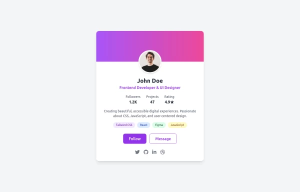 Uses emoji for attention, mentions key features (modern, responsive, accessible)
Drop-in Tailwind CSS profile card component with responsive layout, gradient header, and hover effects - zero custom CSS needed. Features skill tags, social icons, and clean stats display. Just copy-paste the HTML, swap in your details, and you're live. Perfect for portfolios, developer profiles, or link-in-bio pages.
10 months ago1.1k -
 1 year ago2.2k
 -
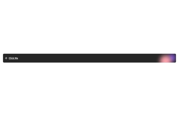 Free Animated Gradient Glow Button with Tailwind CSS
A modern, responsive Tailwind CSS button with glowing gradient hover effects, smooth animations, and an integrated SVG icon. Perfect for landing pages, call-to-action buttons, or any stylish UI project. Fully customizable and open source , ready to copy, paste, and use in your projects.
5 months ago381


Explore components by Tags
Didn't find component you were looking for?
Search from 3000+ components