Animated Coming Soon Page 3
This tailwind example is contributed by $@(\/)(\/)¥, on 04-Dec-2024. Component is made with Tailwind v3.4. It is responsive. It supports dark mode. similar terms for this example are Transitions,upcoming, Pre-launch page, Teaser page, Under construction page, Placeholder page, Sneak peek page,Launch page

Related Examples
-
-
 Animated Coming Soon Page 2
Animated Coming soon Page
4.4k -
Plug and Play Animated Button for Hero Statements / Landing Pages
REMOVE the bg-black from the outside <button/> div, if you are already using a black background. Besides this, the button is plug and play! Know errors: You may need to remove animate-spin for your usecase, depending on framework rendering. For SvelteKit, animate-spin is NOT needed. But the [animation:spin_4s]... is always necessary for a smooth effect. Check out my profile to join my community online or add me on LinkedIn.
2.6k -

-
 644
-

-
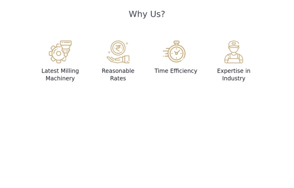 Why Us section with hover animation
Why to choose us section, responsive and hove animation
5.8k -
 Ripple Button
 is an interactive button component with a ripple animation that responds to user clicks
1.8k -

-
 Scooby’s Hello – A Tailwind CSS Cartoon Animation
A playful animation built with Tailwind CSS and minimal custom CSS, featuring a cartoon-style Scooby-inspired dog sliding in from the left, wagging its tail, and cheerfully saying "Hello!"—perfect for adding personality to a fun web project.
1.3k -
 Animated button
on hover underline will go from left to right
6.2k -
 830






Browse by topic
Explore components by Tags
Jump straight to the UI pattern you need.
Can't find it?
Didn't find the component you were looking for?
Search across 3,000+ community-built components and grab the code in seconds.