Animated Coming Soon 4
This tailwind example is contributed by $@(\/)(\/)¥, on 09-Jan-2025. Component is made with Tailwind v3.4. It is responsive. It supports dark mode. similar terms for this example are Transitions,upcoming, Pre-launch page, Teaser page, Under construction page, Placeholder page, Sneak peek page,Launch page

Related Examples
-
 Animated Info Card
Animated info card
1.8k -
Coming soon page with working count down timer
Update the date according to your need
8.2k -
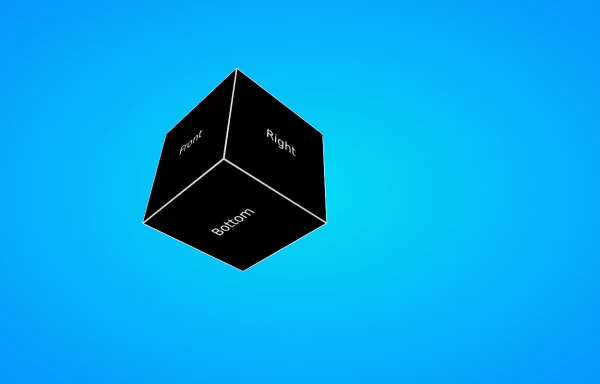 6.6k
6.6k -
 Coming Soon Page
Modern , gradient coming soon page
2.5k -
Pixel Blast
Pixel Blast
-
 use-scroll-effect
use-scroll-effect
959 -

-
 background animation
background animation
1.2k -
 Animated Coming Soon Page 1
animated coming soon landing page
1.4k -
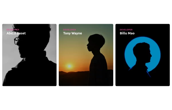 Responsive Cards with Hover Text Reveal Animation - Built with Tailwind CSS
nhance your website with these sleek, responsive cards designed using Tailwind CSS! Featuring a stylish hover animation, the text smoothly reveals when you hover over the card, adding a dynamic touch to your user interface. Perfect for portfolios, team profiles, or project showcases, this design adapts seamlessly to all screen sizes.
2.3k -

-
 3D Coverflow Slider — Ambient Background
A depth-based 3D slider with real perspective and rotateY transforms (not just fade), paired with a drifting polyhedra background that responds to cursor movement. Zero dependencies — pure Tailwind utilities, one config file, and vanilla JS. Auto-plays, pauses on hover, fully keyboard/dot-navigable. Swap the color tokens in the config to reskin it.
131






Browse by topic
Explore components by Tags
Jump straight to the UI pattern you need.
Can't find it?
Didn't find the component you were looking for?
Search across 3,000+ community-built components and grab the code in seconds.