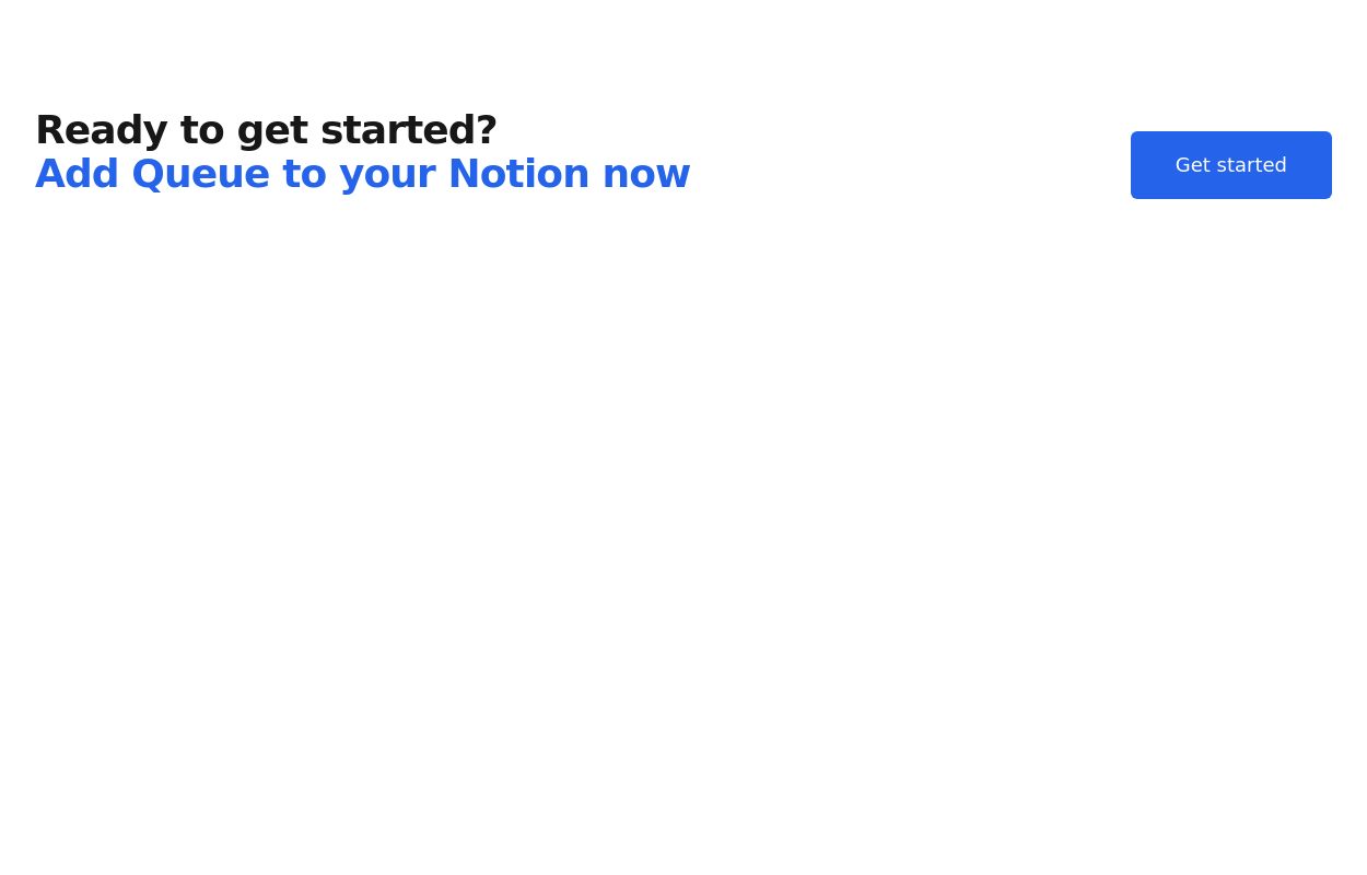
Call for action
This tailwind example is contributed by Sophia Baker, on 19-Jan-2023. Component is made with Tailwind CSS v3. It is responsive. similar terms for this example are CTA,banner

Author Sophia Baker
Related Examples
-
 Chat Bot
Simulation of a chat bot that can be used for conversations as a sketch idea
1 year ago3.6k -
 3 years ago9.5k
 -
 Call ya
Simple Call-to-Action
1 year ago1.3k -
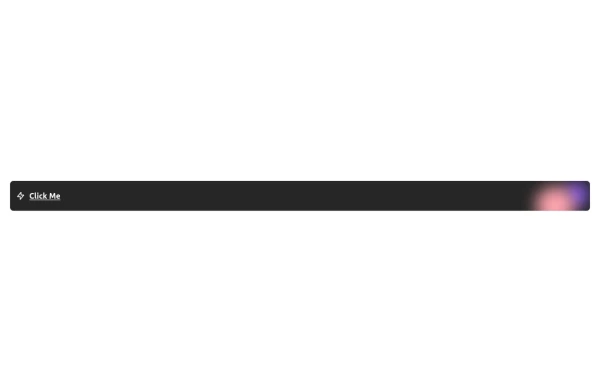 Free Animated Gradient Glow Button with Tailwind CSS
A modern, responsive Tailwind CSS button with glowing gradient hover effects, smooth animations, and an integrated SVG icon. Perfect for landing pages, call-to-action buttons, or any stylish UI project. Fully customizable and open source , ready to copy, paste, and use in your projects.
5 months ago376 -
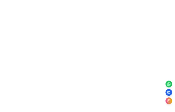 Floating Action Button
This component displays a fixed, floating contact button panel positioned at the bottom-right corner of the screen. It provides users with quick access to key communication channels including WhatsApp, Email, and Instagram. Each icon is styled with vibrant, platform-specific colors and includes subtle hover animations for an interactive user experience. Ideal for improving accessibility and encouraging user engagement, especially on mobile devices.
10 months ago1.5k -
 3 years ago10.6k
 -
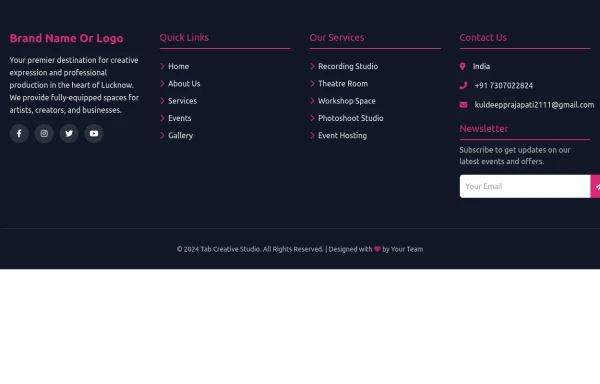 Footer
A footer is a critical part of any professional website. A footer ensures your website is complete, professional, user-friendly, and legally compliant. It's where users go for answers when they're done scrolling.
8 months ago1k -
 2 years ago13.6k
 -
 Responsive CTA
Tailwind CTA card
1 year ago2.5k -
 1 year ago2.7k
 -
 3 years ago11.1k
 -
 3 years ago9.1k


Explore components by Tags
Didn't find component you were looking for?
Search from 3000+ components