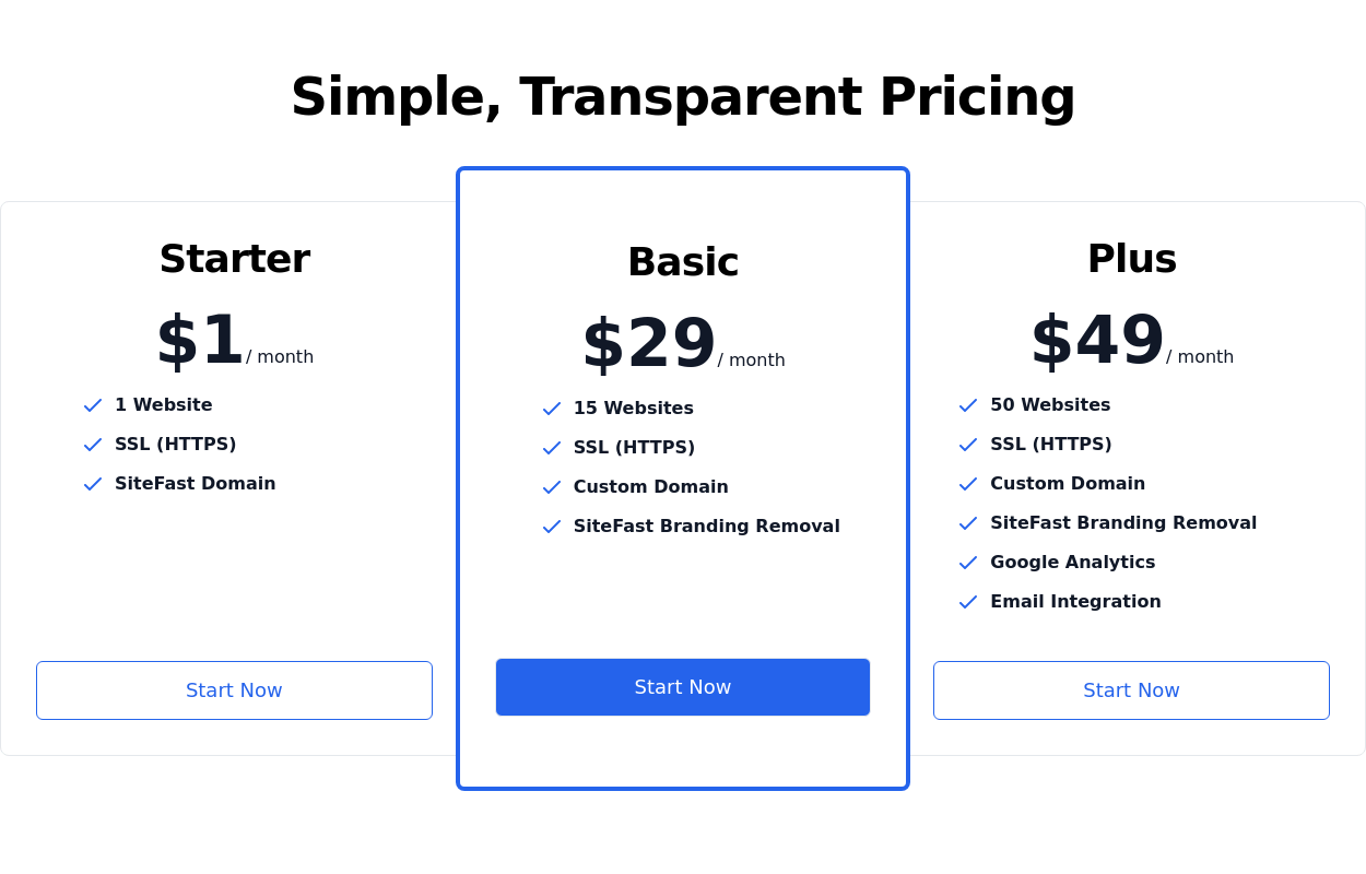
Pricing Plan Selector
radio buttons for selecting a pricing plan
This tailwind example is contributed by Rafferty Kim, on 21-Sep-2023. Component is made with Tailwind CSS v3. It is responsive. It supports dark mode. similar terms for this example are Service rates, Subscription plans

Author Rafferty Kim
Related Examples
-
 Radio Buttons
Users can click anywhere on the input field to select the radio option
3 years ago17k -
 2 years ago14.3k
 -
 Pricing section
Service/product pricing section
3 years ago13.2k -
 2 years ago10.7k
 -
 Radio Button Group for Search Filters
set of radio buttons grouped for selecting different search filters
2 years ago5.6k -
 3 years ago11.4k
 -
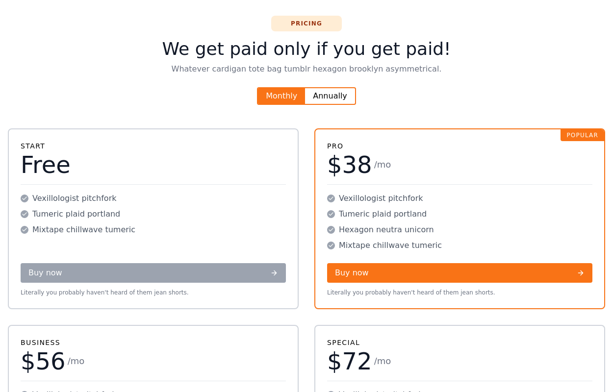 Responsive pricing cards with heading
grid of 4 pricing cards with a Switch button for Monthly Annually plans and heading
2 years ago13.8k -
 3 years ago14.1k
 -
 Pricing Plan Selector
radio buttons for selecting a pricing plan
1 year ago3.8k -
 Pricing cards
pricing section with 3 cards
3 years ago12k -
 11 months ago1.1k
 -
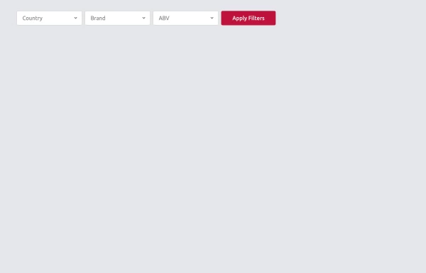 Multi-Select Dropdown Filter with search
Interactive filtering component built with Alpine.js and Tailwind CSS, featuring searchable multi-select dropdowns with dynamic URL parameters. The system includes responsive design, real-time search functionality, and visual feedback through selected item tags that can be easily removed.
1 year ago2.1k


Explore components by Tags
Didn't find component you were looking for?
Search from 3000+ components