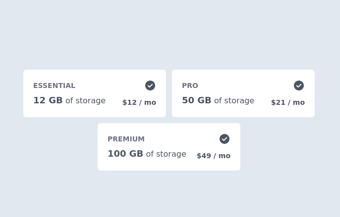
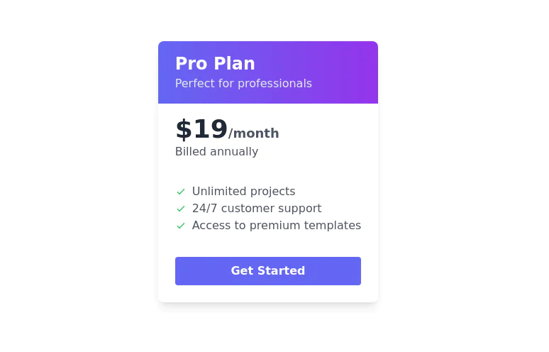
Pricing cards in pair
This tailwind example is contributed by Nour Haider, on 05-Jun-2023. Component is made with Tailwind CSS v3. It is responsive. similar terms for this example are Service rates, Subscription plans

Author Nour Haider
Related Examples
-
 Pricing Plan Selector
radio buttons for selecting a pricing plan
2 years ago10.3k -
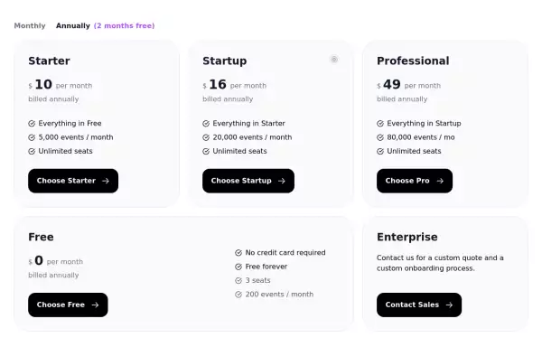
 Pricing section
Service/product pricing section
3 years ago13.1k -
 3 years ago14.7k
 -
 3 years ago13k
 -
 2 years ago14.9k
 -
 3 years ago14.1k
 -
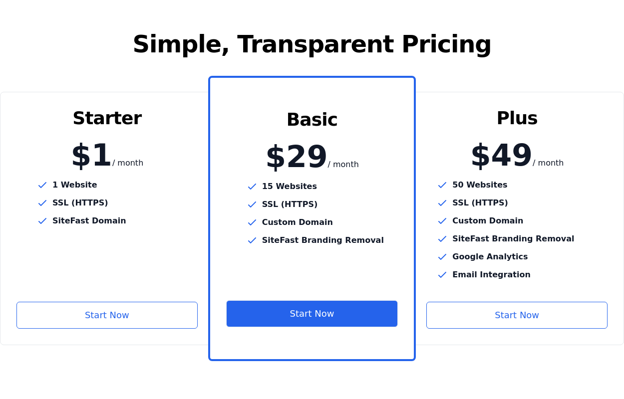
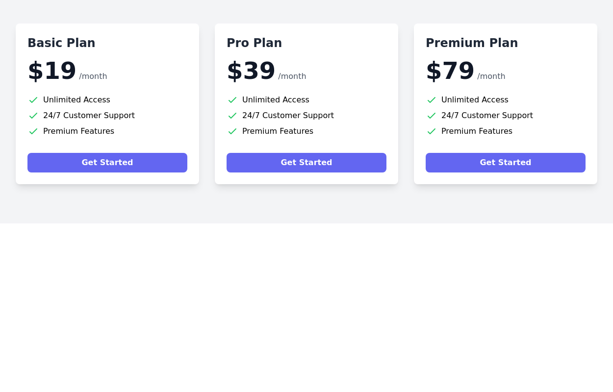
 Pricing cards
pricing section with 3 cards
3 years ago11.9k -
 Pricing Card with gradient background
A sleek and transparent card displaying your product's pricing. It's designed to be both visually appealing and informative, helping users understand your pricing options at a glance.
2 years ago8.3k -
 Pricing Table
Modern and visually appealing design
2 years ago7k -
 Simple pricing card
minimal pricing card
2 years ago8.7k -
 3 years ago11.1k
 -
 1 year ago2.5k


Explore components by Tags
Didn't find component you were looking for?
Search from 3000+ components