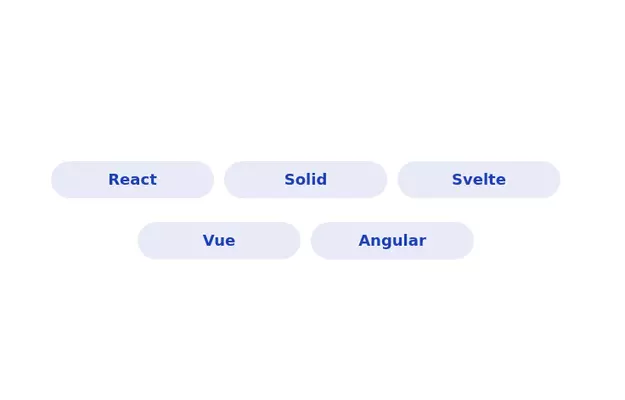
Radio Button Group for Search Filters
set of radio buttons grouped for selecting different search filters
This tailwind example is contributed by Prajwal Hallale, on 12-Dec-2023. Component is made with Tailwind CSS v3. It is responsive.

Author Prajwal Hallale
Related Examples
-
 3 years ago17.6k
 -
 Radio Buttons
Users can click anywhere on the input field to select the radio option
3 years ago17k -
 3 years ago12.7k
 -
 3 years ago9.2k
 -
 3 years ago11.1k
 -
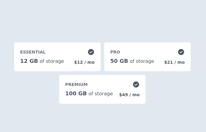 Pricing Plan Selector
radio buttons for selecting a pricing plan
2 years ago10.3k -
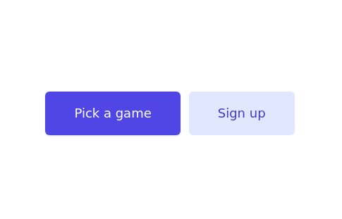
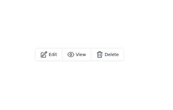 Button group with icon
edit, view, and delete buttons group
3 years ago17.6k -
 2 years ago10.5k
 -
 3 years ago16.1k
 -
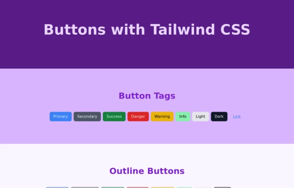
 Lots of button examples
tailwind button examples
9 months ago596 -
 3 years ago10.8k
 -
 Tailwind Different Button Styles
Fully Responsive Buttons
1 year ago2.3k


Explore components by Tags
Didn't find component you were looking for?
Search from 3000+ components