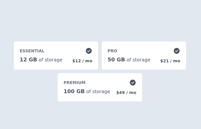
Responsive pricing cards with heading
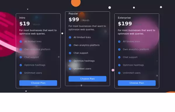
grid of 4 pricing cards with a Switch button for Monthly Annually plans and heading
This tailwind example is contributed by Erik Hyatt, on 04-May-2023. Component is made with Tailwind CSS v3. It is responsive. similar terms for this example are Service rates, Subscription plans

Author Erik Hyatt
Related Examples
-
 3 years ago15k
 -
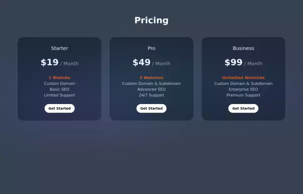
 Tiered Pricing Blocks
An organized way to compare different product offerings or pricing tiers. Users can quickly assess the features and pricing for various products.
2 years ago9.5k -
 3 years ago11.4k
 -
 Pricing Plan Selector
radio buttons for selecting a pricing plan
2 years ago10.4k -
 2 years ago9.3k
 -
 Minimalist Pricing Section
A minimal but nice pricing section.
1 year ago2.7k -
 Pricing Cards
the component is designed to showcase and compare prices between different subscription plans.
2 years ago7.5k -
 Interactive Multi-Method Donation Section
Overview: A high-trust, conversion-oriented fundraising section styled in the project's signature Navy Blue theme. It provides users with flexible payment options, ranging from one-click fixed amounts to manual bank transfers and cryptocurrency donations. Key Features: Smart Amount Logic: Includes a JavaScript-powered selector where users can choose a preset amount ($10, $25, $50) or type a custom value. The interface automatically toggles states (deselecting buttons when typing, and vice-versa) to prevent user error. Payment Methods: Quick Card/Checkout: Primary call-to-action column. Bank Transfer: A clean card displaying account details with a "Copy to Clipboard" utility. Crypto (Bitcoin): A specialized dark-themed card featuring a placeholder QR code and wallet address copying functionality. Trust Signals: Includes security iconography (lock, shield) and reassuring copy to boost donor confidence. Visual Hierarchy: Uses a 7/5 grid split to prioritize the immediate donation action while keeping manual payment methods accessible but secondary. Tech Stack: Framework: Tailwind CSS. Icons: Ionicons. Scripting: Vanilla JavaScript (for amount toggling and clipboard copying functions). Fonts: DM Serif Display (Headings) + Inter (Body). Usage: Ideal for the "Support Us" page or a dedicated campaign landing page. The script tag included at the bottom handles all the interactivity (button selection and text copying) without needing external libraries.
3 months ago451 -
 "Visit Rwanda" tourism website focusing on wildlife, particularly mountain gorillas
Key Features of This Rwanda Tourism Website: Focus on Mountain Gorillas ("Ingagi"): Dedicated section highlighting gorilla trekking experiences Information about conservation efforts Booking options for gorilla permits Wildlife Showcase: Featured animals including gorillas, golden monkeys, elephants, lions, and more Beautiful image cards for each species Conservation-focused messaging National Parks Information: Sections on Volcanoes, Akagera, and Nyungwe National Parks Visual highlights of each park's unique features User Experience: Responsive design that works on all devices Attractive color scheme inspired by Rwanda's landscapes Easy navigation with clear calls-to-action Practical Information: Contact form for tour inquiries Testimonials from previous visitors Footer with important links and contact details
8 months ago933 -
 Pricing Card with gradient background
A sleek and transparent card displaying your product's pricing. It's designed to be both visually appealing and informative, helping users understand your pricing options at a glance.
2 years ago8.3k -
 Pricing
Looks better with in [Line-2] with: md:w-3/5
1 year ago1.1k -
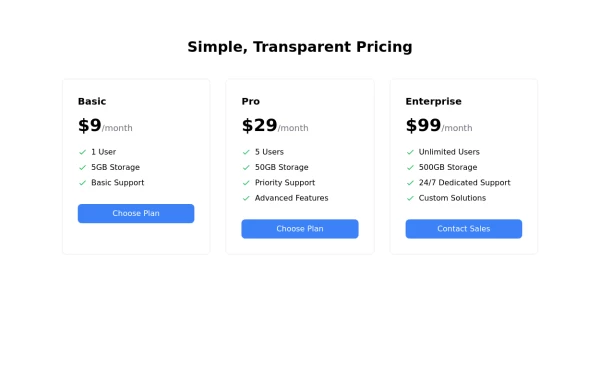
 Product Pricing Section
This component displays pricing plans for your product or service. It provides a clean and visually appealing layout for showcasing different pricing tiers with their respective features and prices.
2 years ago8.8k


Explore components by Tags
Didn't find component you were looking for?
Search from 3000+ components