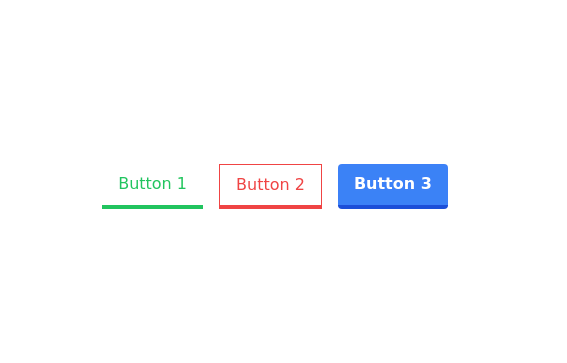
Buttons with border bottom
This tailwind example is contributed by Prashant, on 19-Sep-2022. Component is made with Tailwind CSS v3. It is responsive.

Author Prashant
Related Examples
-
 2 years ago12.5k
 -
 Buttons popup on hover
Popup buttons on hover
3 years ago14.5k -
3 years ago16.2k
-
 3 years ago17.6k
 -
 3 months ago336
 -
 Previous Next Buttons
Pagination buttons
3 years ago14.3k -
 Download App Buttons
Ready-to-use Apple App Store and Google Play Store download buttons with official branding and styling
3 months ago461 -
Beautiful animated button
on hover effect
1 year ago5.2k -
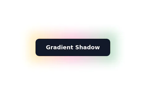
Background Gradient Button with Hover Effects
The button designed with a gradient background that transitions smoothly between three colors
2 years ago8.1k -
 2 months ago281
 -
 Neo-Brutalism UI Button Collection - Bold CSS Button Styles withTailwind CSS
Bold, chunky neo-brutalism buttons with thick borders and strong shadows for modern web design. Explore our collection of vibrant, high-contrast CSS buttons with hover effects and dark mode support.
2 months ago486 -
Color Changing Gradient Button
Color Changing Gradient Button
1 year ago3.6k


Explore components by Tags
Didn't find component you were looking for?
Search from 3000+ components