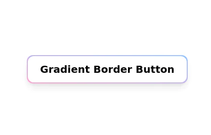
Background Gradient Button with Hover Effects
The button designed with a gradient background that transitions smoothly between three colors
This tailwind example is contributed by Kavita Joshi, on 04-Dec-2023. Component is made with Tailwind CSS v3. It is responsive.

Author Kavita Joshi
Related Examples
-
Glowing gradient button
Button on black background
3 years ago39.5k -
 Glowing gradient button
Button on black background
2 years ago12.6k -
3 years ago14.6k
-
 3 years ago16.4k
 -
 3 years ago17.6k
 -
 2 years ago16.7k
 -
 Botton hover
On hover Changes text
2 years ago7.1k -
 Underline Hover Effect
Hover effect using after and before pseudo elements.
2 years ago9.6k -
 Ripple Button
Ripple Button is an interactive button component with a ripple animation that responds to user clicks
1 year ago1.2k -
 Social buttons
Mono-color Social buttons change colors according to your need
3 years ago12.2k -
3 years ago16.3k
-
 Plug and Play Button - Animated gradient background
Know errors: You may need to remove animate-spin for your usecase, depending on framework rendering. For SvelteKit, animate-spin is NOT needed. But the [animation:spin_4s]... is always necessary for a smooth effect. Check out my profile to join my community online or add me on LinkedIn.
1 year ago2.1k


Explore components by Tags
Didn't find component you were looking for?
Search from 3000+ components