Neo-Brutalism UI Button Collection - Bold CSS Button Styles withTailwind CSS
Bold, chunky neo-brutalism buttons with thick borders and strong shadows for modern web design. Explore our collection of vibrant, high-contrast CSS buttons with hover effects and dark mode support.
This tailwind example is contributed by Homayoun, on 25-Nov-2025. Component is made with Tailwind CSS v3. It is responsive. It supports dark mode.

Author Homayoun
Related Examples
-
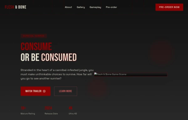
3 years ago14.4k
-
 1 year ago3.1k
 -
 Tailwind CSS Button (Wavy Button)
The button uses Tailwind classes for size, background, border, border-radius, shadow, cursor, overflow, and transitions. The wave overlay is absolutely positioned at the bottom of the button, initially off-screen (top-full) and moves to the middle (top-1/2) on hover via the custom .wave class and keyframes. The font-poppins class isn’t a default Tailwind class. You should define it in your Tailwind configuration or replace it with font-sans if you haven't extended fonts.
7 months ago938 -
 Componentes para mi empresa
para mi empresa
9 months ago1k -
 Underline Hover Effect
Hover effect using after and before pseudo elements.
2 years ago9.4k -
 3 years ago18.2k
 -
 Game changer
by salvator
8 months ago836 -
Background gradient changing button
Automatic and continuously gradient-changing button. Cyclic color changing button.
2 years ago11.2k -
 Ripple Button
Ripple Button is an interactive button component with a ripple animation that responds to user clicks
1 year ago1.2k -
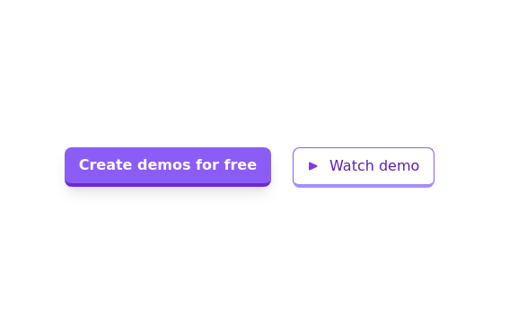 Call to action buttons
Pair of active primary and secondary buttons. Elevated buttons w/ border bottom
2 years ago9.6k -
 1 year ago3.2k
 -
Color changing button
changes the color of a button automatically and continuously
2 years ago8.5k


Explore components by Tags
Didn't find component you were looking for?
Search from 3000+ components