button-neon-purple-super
This tailwind example is contributed by Mohammad Rashel, on 13-Dec-2025. Component is made with Tailwind v3.4. It is responsive.

Related Examples
-
 Sharp corner button design
button with hover effect
13.5k -
 Underline Hover Effect
Hover effect using after and before pseudo elements.
10.2k -
Hover Button
Hover button then a overlay came from bottom to top
2.7k -

-
 Button with hover effect
Button with light hover effect, responsive and suitable for light/dark mode.
898 -

-
 Corner‑Framed Hover Transition Buttons
Minimal CTA buttons featuring animated corner shapes and smooth width transitions on hover, built with Tailwind CSS for a sharp, modern UI.
23 -
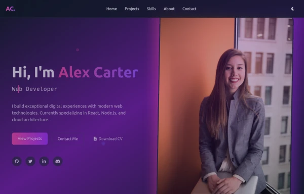 modern portifolio
by salvator
1.2k -
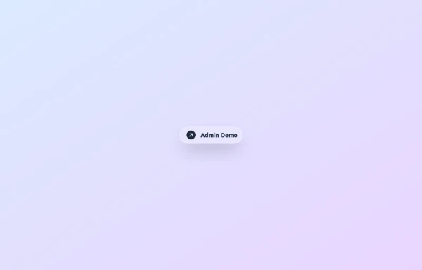 Animated Gradient Button Component
Button component with smooth hover effects and glass-morphism design. Features expanding gradient animation, rotating icon, and responsive layout. Perfect for call-to-action buttons, landing pages, and web applications. Easy copy-paste Tailwind CSS code ready for integration.
1.5k -

-
 11.7k
-
 Primary Button
Elegant button
12.5k







Browse by topic
Explore components by Tags
Jump straight to the UI pattern you need.
Can't find it?
Didn't find the component you were looking for?
Search across 3,000+ community-built components and grab the code in seconds.