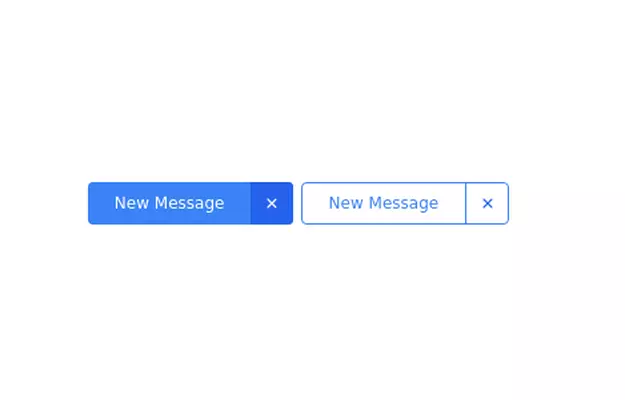
Beautiful animated button
on hover effect
This tailwind example is contributed by Dika Rahman, on 27-Mar-2024. Component is made with Tailwind CSS v3. It is responsive. It supports dark mode.

Author Dika Rahman
Related Examples
-
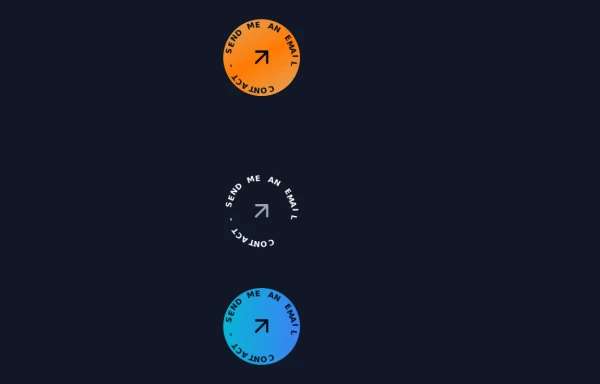 Contact Spinner
Contact button spinning
1 year ago5.8k -
Button wih hover gradient
Works well with the dark theme
2 years ago18.3k -
 3 years ago10.8k
 -
 Neo-Brutalism UI Button Collection - Bold CSS Button Styles withTailwind CSS
Bold, chunky neo-brutalism buttons with thick borders and strong shadows for modern web design. Explore our collection of vibrant, high-contrast CSS buttons with hover effects and dark mode support.
3 months ago686 -
 shadcn Button
button
1 year ago2.6k -
Button With Loader
Tailwind Loader
2 years ago3k -
Glowing gradient button
Button on black background
3 years ago39.6k -
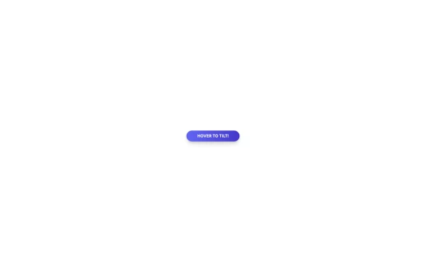 Tilted button on hover.
A simple button with a gradient and tilt on hover. Dark mode supported with same color.
1 year ago983 -
Plug and Play Animated Button for Hero Statements / Landing Pages
REMOVE the bg-black from the outside <button/> div, if you are already using a black background. Besides this, the button is plug and play! Know errors: You may need to remove animate-spin for your usecase, depending on framework rendering. For SvelteKit, animate-spin is NOT needed. But the [animation:spin_4s]... is always necessary for a smooth effect. Check out my profile to join my community online or add me on LinkedIn.
1 year ago2k -
 Previous Next Buttons
Pagination buttons
3 years ago14.5k -
Canlı Yayın Butonu
Pulse efekt içeren canlı yayın butonu.
1 year ago1.9k -
 3 years ago9.3k


Explore components by Tags
Didn't find component you were looking for?
Search from 3000+ components