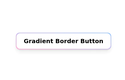
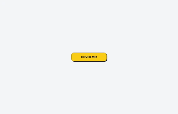
Color Changing Gradient Button
Color Changing Gradient Button
This tailwind example is contributed by EquinoX, on 03-Apr-2024. Component is made with Tailwind CSS v3. It is responsive. It supports dark mode.

Author EquinoX
Related Examples
-
 Card
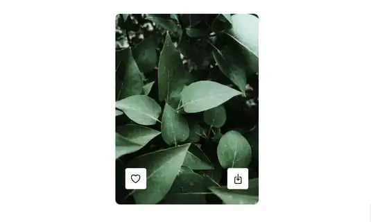
CardCard with Likes and download Button
2 years ago10.5k -
 8 months ago1.8k
 -
 3 years ago16.2k
 -
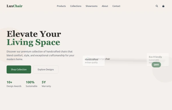 chair
chairby salvator
6 months ago670 -
 1 year ago2.3k
 -
 2 years ago16.1k
 -
 Tailwind CSS Button (Wavy Button)
The button uses Tailwind classes for size, background, border, border-radius, shadow, cursor, overflow, and transitions. The wave overlay is absolutely positioned at the bottom of the button, initially off-screen (top-full) and moves to the middle (top-1/2) on hover via the custom .wave class and keyframes. The font-poppins class isn’t a default Tailwind class. You should define it in your Tailwind configuration or replace it with font-sans if you haven't extended fonts.
5 months ago833 -
 2 years ago16k
 -
 flower
by salvator
6 months ago888 -
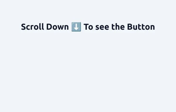 Floating "Go to Top" Button with Tailwind CSS
🚀 Boost your website’s user experience with a sleek floating "Go to Top" button! This easy-to-implement solution uses Tailwind CSS for styling. ✔️ Smooth scroll to top ✔️ Clean and modern design ✔️ Responsive and animated effects Perfect for any website or portfolio! Add it today and make navigation effortless! 🔝💻
8 months ago684 -
 Get the app section
Play store and App store buttons
2 years ago9.6k -
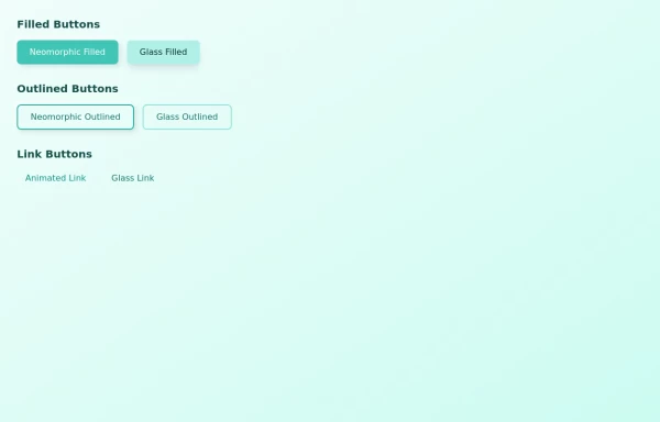 buttons group
some attractive button group on different varients primary, outlined and link button
1 year ago1.8k


Explore components by Tags
Didn't find component you were looking for?
Search from 3000+ components