Buttons popup on hover
Popup buttons on hover
This tailwind example is contributed by Sophia Baker, on 20-Jan-2023. Component is made with Tailwind v3.4.

Related Examples
-

-
 Google login/signup button
Styled button designed for users to log in or authenticate using their Google account. The button features a Google logo (represented by an SVG image) on the left and the text "Login with Google" on the right.
41.7k -
-
Glowing gradient button
Button on black background
41.1k -
-
-
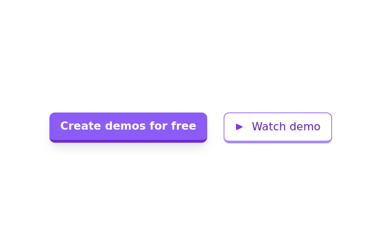 Call to action buttons
Pair of active primary and secondary buttons. Elevated buttons w/ border bottom
10.4k -
 Glowing gradient button
Button on black background
13.2k -
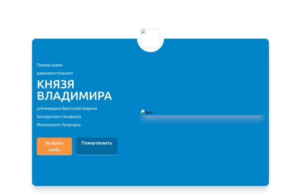 Home page 2
Отзывчивый логотип по центру. Интерактивные кнопки призыва к действию.
1.4k -
 Continue with Google button
Login with google button for social login.
25.6k -
 Buuton
Logout button
263





Browse by topic
Explore components by Tags
Jump straight to the UI pattern you need.
Can't find it?
Didn't find the component you were looking for?
Search across 3,000+ community-built components and grab the code in seconds.