iPhone 15 Mockup
The "Screen Content" div can be manipulated to have anything inside the screen.
This tailwind example is contributed by Coastal UI, on 12-Nov-2024. Component is made with Tailwind CSS v3. It is responsive. similar terms for this example are simulation,copy,dummy,miniature,like

Author Coastal UI
Related Examples
-
 5 months ago387
 -
 3 years ago8.8k
 -
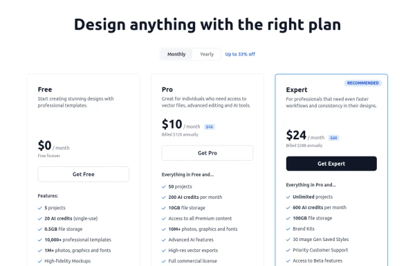 Modern Responsive Pricing Section with Toggle
A sleek, responsive pricing section built with HTML and Tailwind CSS, showcasing three distinct plans (e.g., Free, Pro, Expert) in a card layout. It features a clean monthly/yearly toggle switch with savings indication, highlights a recommended plan with distinct styling and a badge, and uses checkmarks for clear feature comparison. The layout stacks vertically on smaller screens and transitions to a 3-column grid on large screens (lg breakpoint). Includes generic content for easy adaptation and a final "Compare Plans" button.
10 months ago1.1k -
 1 year ago2.7k
 -
 Atlas AI Analyst Workspace
A premium, document-centric AI chat interface that moves beyond standard bubbles into a professional "editor" layout. Designed for power users, it features a floating glassmorphic command bar, a dedicated "Memory & Context" sidebar with interactive widgets, and rich data visualization blocks. The aesthetic combines a deep charcoal base with luxury bronze/orange accents, making it ideal for high-end SaaS tools, financial analysis dashboards, or enterprise AI assistants.
2 months ago120 -
 1 year ago1.1k
 -
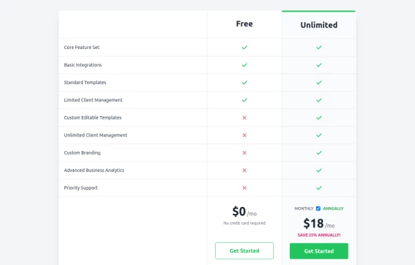 Comparison Pricing Table Component
A responsive pricing table built with HTML and Tailwind CSS, comparing two plans (Free and Unlimited) with a clear feature checklist. Includes distinct styling for the premium plan and a toggle for monthly/annual pricing display.
10 months ago1.5k -
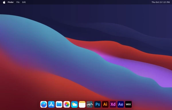 macOS Style Webpage – macOS Design in the Browser
A simple webpage inspired by the macOS interface. It recreates the clean design, dock, and desktop look of macOS using only HTML, tailwind CSS, and JavaScript. This project focuses on front-end styling and layout to bring the visual feel of macOS to the web — not a full simulation, just the look and vibe.
4 months ago1.2k -
 5 months ago715
 -
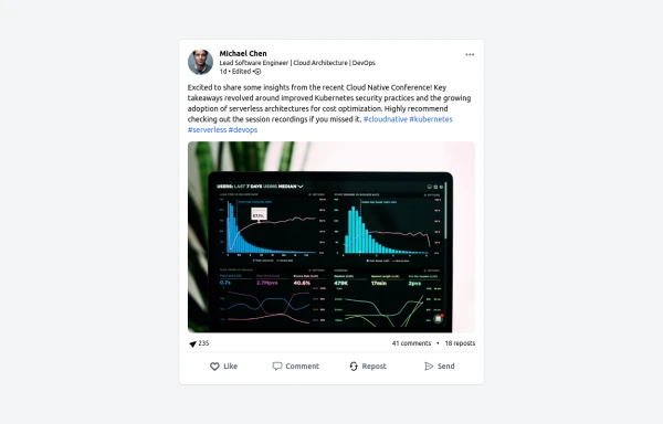 LinkedIn Post UI Mockup
A static HTML and Tailwind CSS component designed to replicate the user interface of a LinkedIn post. This mockup accurately represents the post structure including the header (avatar, name, headline, timestamp), content area (text, optional media), engagement statistics (likes, comments, reposts), and the action bar (Like, Comment, Repost, Send). It's fully responsive, supports light and dark themes, and uses appropriate iconography and styling to closely mimic the LinkedIn feed experience.
10 months ago1.3k -
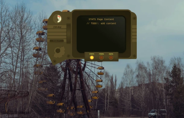 CSS-Boy
Inspired by the Pip-Boy Model 3000 from Fallout: New Vegas. Comes with multiple pages and some animations. All decorative background elements disappear when the screen is <sm (it's responsive).
9 months ago888 -
 11 months ago1.2k


Explore components by Tags
Didn't find component you were looking for?
Search from 3000+ components