Material 3 Text Fields [Light]
Text fields that conform to Google's Material 3 design guidelines. Can be used for single-line text fields as well as textareas.
This tailwind example is contributed by Nick Girga, on 27-May-2025. Component is made with Tailwind v3.4. It is responsive.

Related Examples
-
-
 1.1k
-
 15.1k
-
 Date picker
 example using flatpickr library
18.3k -
 Multi Range Slider
Adjust the sliders to set your preferred price range. The left slider sets the minimum price, and the right slider sets the maximum price. The selected range is displayed below the sliders in real-time, allowing you to easily filter products within your budget.
2.6k -
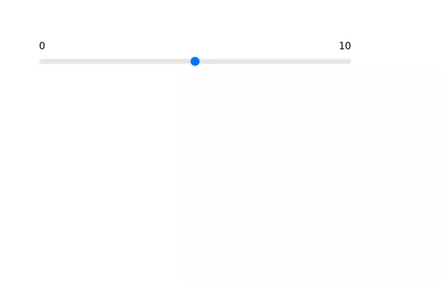 Range slider
 with upper limit and lower limit.
13.1k -
-
Hover Button
Hover button then a overlay came from bottom to top
2.7k -
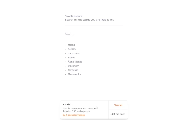 Search input with Tailwind CSS and Alpinejs
How to create a search input with Tailwind CSS and Alpinejs
4.2k -
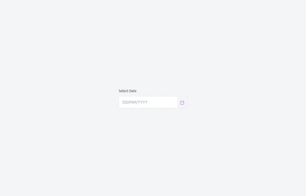 Custom Date Picker with TailwindCSS and Vanilla JavaScript
A lightweight, responsive date picker built with TailwindCSS for styling and vanilla JavaScript for interactivity. It includes an input field with a calendar dropdown, month navigation, and a “Today” shortcut button. The component is designed to be mobile-friendly, easy to customize, and can be integrated into any project without dependencies like React or external UI libraries.
1.5k -
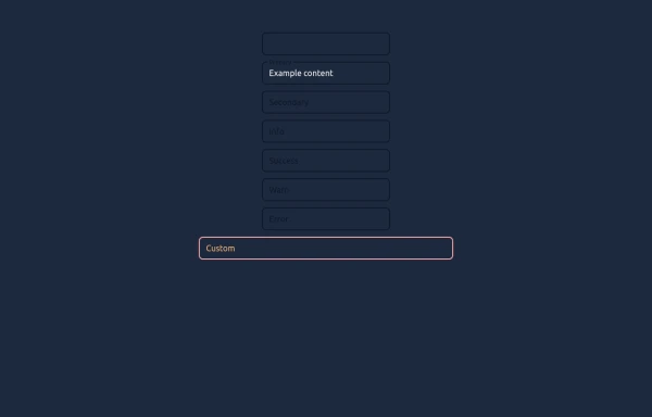 Elegant Textboxes
Useful Tailwind classes for creating several types of animated textboxes. Inspired by Google's floating label input fields.
1.3k



Browse by topic
Explore components by Tags
Jump straight to the UI pattern you need.
Can't find it?
Didn't find the component you were looking for?
Search across 3,000+ community-built components and grab the code in seconds.