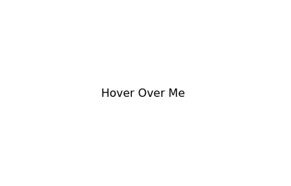
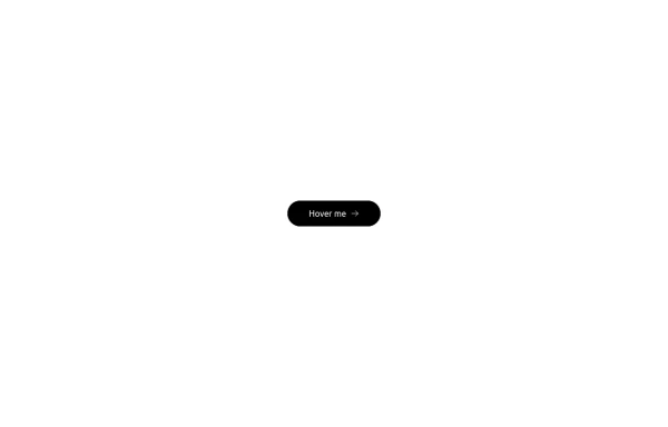
Hover Button
Hover button then a overlay came from bottom to top
This tailwind example is contributed by Md. Tofayel islam, on 17-Sep-2024. Component is made with Tailwind CSS v3. It is responsive. It supports dark mode.

Author Md. Tofayel islam
Related Examples
-
 Sharp corner button design
button with hover effect
3 years ago12.8k -
 Contact us form
Contact us form
2 years ago6.5k -
 Underline Hover Effect
Hover effect using after and before pseudo elements.
2 years ago9.6k -
 Input Formulario
Input used in the form Link form: https://tailwindflex.com/@ameth1208/login
1 year ago3k -
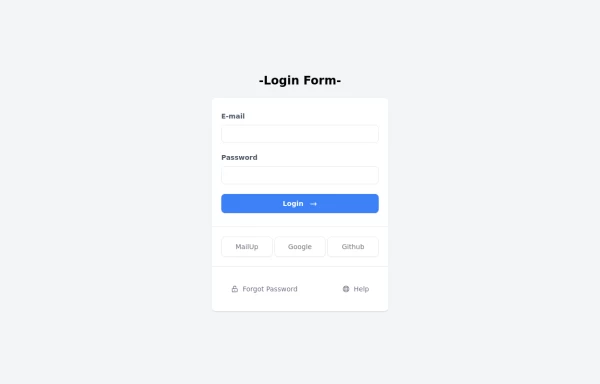 Login Form
Login Form
1 year ago2.3k -
 1 year ago3.2k
 -
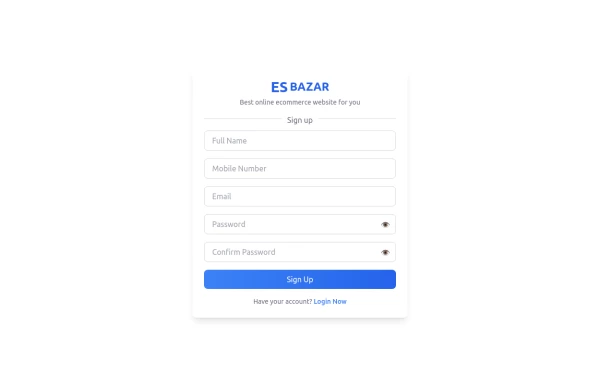 Responsive Sign-Up Form with TailwindCSS
Create a visually appealing and fully responsive sign-up form using TailwindCSS. This form includes input fields for full name, mobile number, email, password, and confirm password, along with a gradient sign-up button. Designed with simplicity and flexibility, it is perfect for modern web applications and easy to integrate into any project.
1 year ago1.5k -
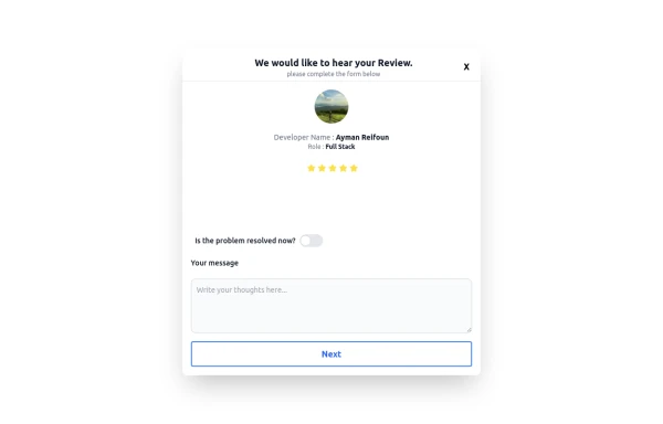 Review popup form with toggle and stars
Review popup form with toggle and stars
11 months ago968 -
 Button with hover effect
Button with light hover effect, responsive and suitable for light/dark mode.
6 months ago436 -
 3 months ago471
 -
 3 months ago433
 -
 Premium Gaming UI Card, Form & Animated Button (Tailwind CSS)
A modern, senior-level gaming UI built with Tailwind CSS focusing on spacing, typography, and calm visual hierarchy rather than noisy effects. This component set includes: A premium gaming card with clear content structure and outcome-focused copy A clean player signup form with accessible focus states and minimal visual noise A custom animated button using a restrained light-sweep effect for premium interaction feedback Designed to resemble real production gaming platforms rather than demo or template UI. Fully responsive, copy-paste ready, and easy to extend for real-world projects.
2 months ago231


Explore components by Tags
Didn't find component you were looking for?
Search from 3000+ components