Material 3 Checkboxes [Light]
Checkboxes that conform to Google's Material 3 design guidelines
This tailwind example is contributed by Nick Girga, on 19-May-2025. Component is made with Tailwind CSS v3.

Author Nick Girga
Related Examples
-
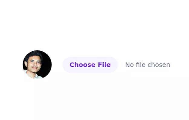 Image input with preview
Show you a preview of the selected image.
3 years ago27.5k -
 1 year ago1.7k
 -
![Material 3 Radio Buttons [Light]](https://tailwindflex.com/storage/thumbnails/material-3-radio-buttons-light/canvas.min.webp?v=9) Material 3 Radio Buttons [Light]
Material 3 Radio Buttons [Light]Radio buttons that conform to Google's Material 3 design guidelines
8 months ago640 -
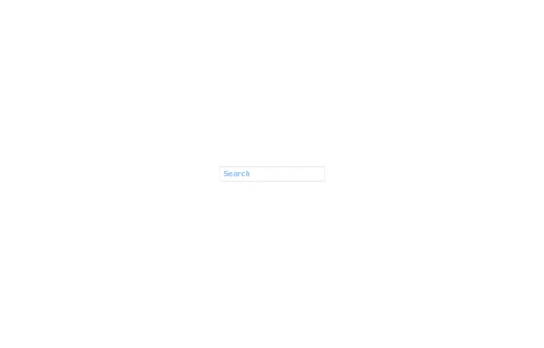 Search input asasasas
sasasasasas
1 year ago1.5k -
 3 years ago10.9k
 -
 Contact us form
Contact us form
2 years ago6.2k -
 Radio Buttons
Users can click anywhere on the input field to select the radio option
3 years ago17k -
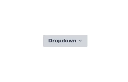 Onhover Dropdown
Open dropdown on hover
3 years ago18.3k -
 tailwind contact form
tailwind contact form
1 year ago2.3k -
 2 years ago12.8k
 -
1 year ago3.1k
-
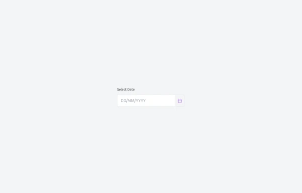 Custom Date Picker with TailwindCSS and Vanilla JavaScript
A lightweight, responsive date picker built with TailwindCSS for styling and vanilla JavaScript for interactivity. It includes an input field with a calendar dropdown, month navigation, and a “Today” shortcut button. The component is designed to be mobile-friendly, easy to customize, and can be integrated into any project without dependencies like React or external UI libraries.
4 months ago462


Explore components by Tags
Didn't find component you were looking for?
Search from 3000+ components