Toggle button
This tailwind example is contributed by Matthew Chen, on 20-Jul-2023. Component is made with Tailwind v3.4. It is responsive.

Related Examples
-

-
 Radio Buttons
Users can click anywhere on the input field to select the radio option
17.1k -
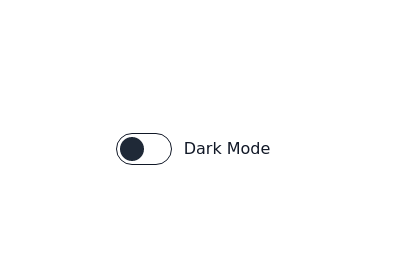 Toggle Switch
Toggle switch for dark mode
18.2k -
-
 14.7k
14.7k -
 Checkbox button
press the button to check
5.4k -
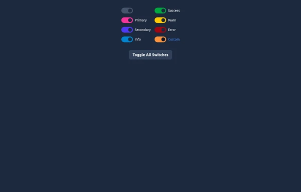 Elegant Switches
Useful Tailwind classes for creating several types of basic switches.
991 -

-
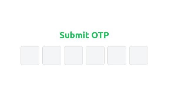 Elegant OTP Input Fields with TailwindCSS
A clean and responsive OTP input field component built with TailwindCSS. This design features six single-character input fields with smooth transitions, light gray borders, and backgrounds. On focus, the borders turn blue, creating a visually appealing and user-friendly experience. Perfect for authentication and verification forms.
2.3k -
-
 18.9k
18.9k -
 11.8k
11.8k







Browse by topic
Explore components by Tags
Jump straight to the UI pattern you need.
Can't find it?
Didn't find the component you were looking for?
Search across 3,000+ community-built components and grab the code in seconds.