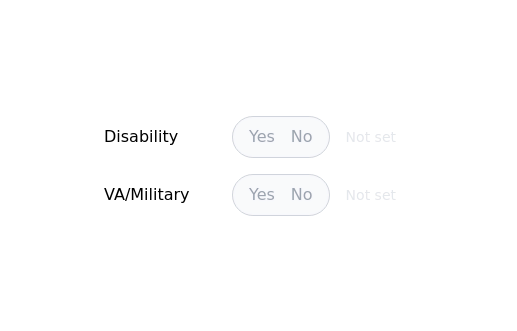
Material 3 Radio Buttons [Light]
Radio buttons that conform to Google's Material 3 design guidelines
This tailwind example is contributed by Nick Girga, on 19-May-2025. Component is made with Tailwind CSS v3.

Author Nick Girga
Related Examples
-
 3 years ago12.7k
 -
 Radio Buttons
Users can click anywhere on the input field to select the radio option
3 years ago17k -
 2 years ago10.5k
 -
 9 months ago625
 -

-
 3 years ago13.7k
 -
 1 year ago2.9k
 -
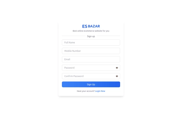 Responsive Sign-Up Form with TailwindCSS
Create a visually appealing and fully responsive sign-up form using TailwindCSS. This form includes input fields for full name, mobile number, email, password, and confirm password, along with a gradient sign-up button. Designed with simplicity and flexibility, it is perfect for modern web applications and easy to integrate into any project.
11 months ago1.5k -
 Search input asasasas
sasasasasas
1 year ago1.5k -
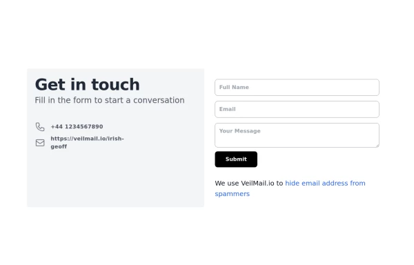 beautiful tailwind contact form
beautiful tailwind contact form
2 years ago6.1k -
 2 years ago7.5k
 -
 2 years ago13.7k


Explore components by Tags
Didn't find component you were looking for?
Search from 3000+ components