nft card
nft card
This tailwind example is contributed by 5upreme505, on 21-Oct-2024. Component is made with Tailwind CSS v3.

Author 5upreme505
Related Examples
-
 Forgot password?
you can change password an time
9 months ago641 -
 1 year ago3.2k
 -
 Card KPI
Targetas ahora con un grafico
3 months ago597 -
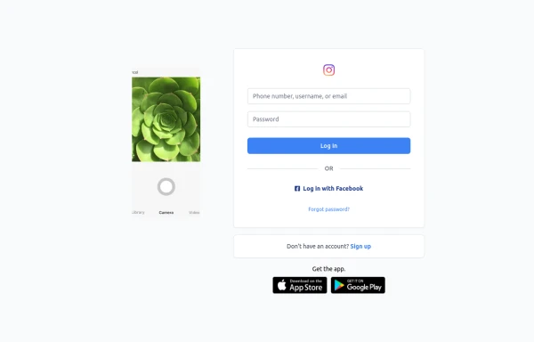 Best Log In page ever
Instagram look like but not copy right 🤗,best login and sign and even for many others
9 months ago849 -
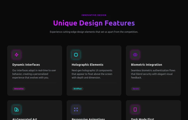 Attractive Feature Section
With Gradient Color 6 Features
7 months ago835 -
 9 months ago1.3k
 -
 Coffee & Tea
Coffee: A brewed drink prepared from roasted seeds, called coffee beans, of the coffee plant. Tea: An agricultural product of the leaves, leaf buds, and internodes of various cultivars and sub-varieties of the Camellia sinensis plant, processed and cured using various methods.
9 months ago999 -
 1 year ago3.3k
 -
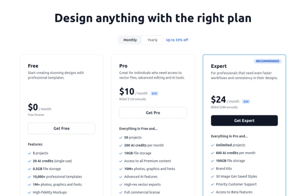 Modern Responsive Pricing Section with Toggle
A sleek, responsive pricing section built with HTML and Tailwind CSS, showcasing three distinct plans (e.g., Free, Pro, Expert) in a card layout. It features a clean monthly/yearly toggle switch with savings indication, highlights a recommended plan with distinct styling and a badge, and uses checkmarks for clear feature comparison. The layout stacks vertically on smaller screens and transitions to a 3-column grid on large screens (lg breakpoint). Includes generic content for easy adaptation and a final "Compare Plans" button.
10 months ago1.1k -
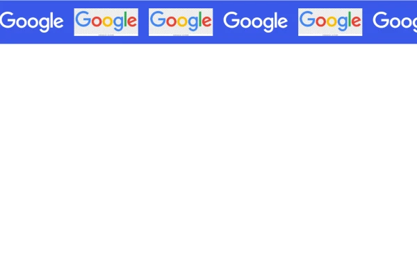 Marquee Slider of Client Logos – Smooth Scrolling Brand Showcase
Enhance your website's credibility with a sleek marquee slider displaying client logos. This continuously scrolling slider provides a dynamic and engaging way to showcase your trusted partnerships, ensuring a professional and visually appealing design. Perfect for businesses, portfolios, and service-based websites.
8 months ago551 -
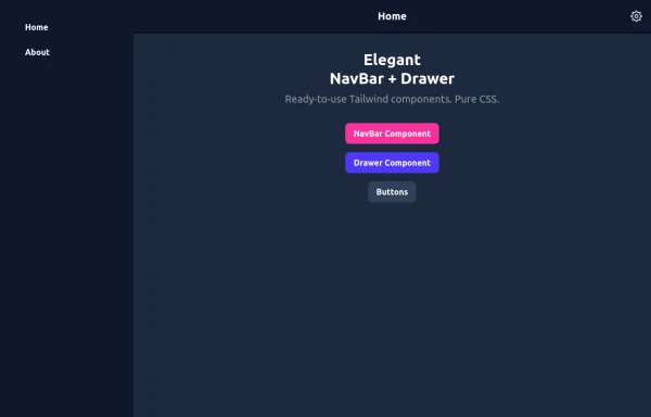 Elegant NavBar + Drawer
A NavBar, a responsive drawer/sidebar, and other useful Tailwind components to get started creating an app. Pure CSS, no JavaScript needed (although this example uses a bit of JS).
10 months ago1.3k -
 cards
cardscards with background animation
2 years ago11.9k


Explore components by Tags
Didn't find component you were looking for?
Search from 3000+ components