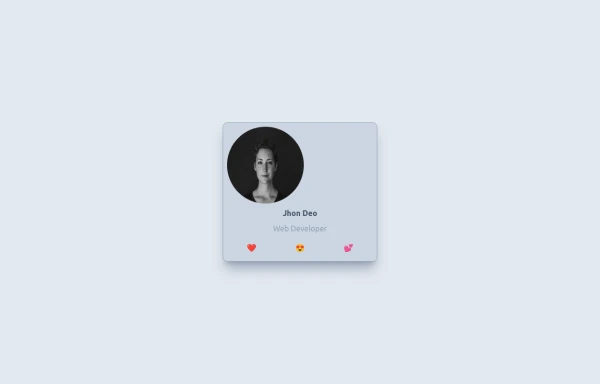
User Profile Card
This User Profile Card includes:
1. Responsive design using Tailwind CSS classes
2. Indigo-800 and Blue-900 color scheme
3. Dark mode support with appropriate color adjustments
4. Profile picture with hover effect
5. User name, job title, and a brief description
6. Social media icons with hover effects
7. Skill tags with hover animations
8. Connect button with hover effect
9. Subtle animations and transitions for better user experience
10. Automatic dark mode detection based on system preferences
Key features:
- The background uses a gradient from Indigo-800 to Blue-900
- The card has a white background in light mode and dark gray in dark mode
- Text colors are adjusted for readability in both light and dark modes
- The profile picture has a border that changes color in dark mode
- Social media icons and skill tags have hover effects
- The Connect button uses Indigo-800 with a Blue-900 hover state
- The entire card has a shadow effect that changes on hover
- Dark mode is automatically applied based on system preferences
This design provides a clean, professional look for a user profile card while incorporating the requested color scheme and maintaining good usability across different devices and color modes.
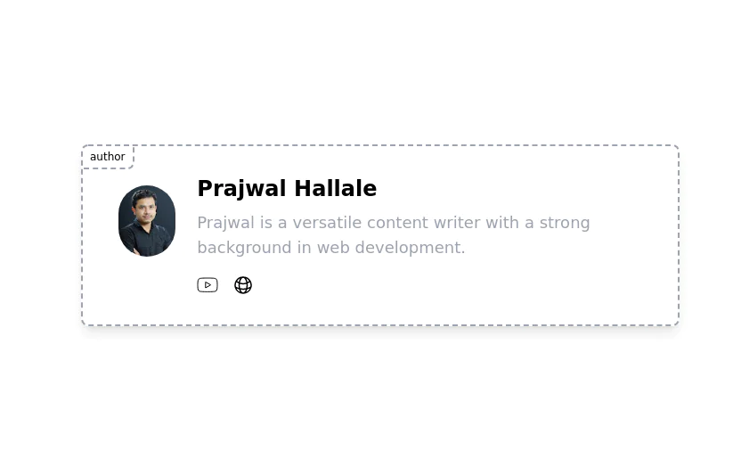
This tailwind example is contributed by nejaa badr, on 31-Oct-2024. Component is made with Tailwind CSS v3. It is responsive. similar terms for this example are Author box, User information

Author nejaa badr
Related Examples
-
 4 months ago518
 -
 2 years ago25.1k
 -
 GitHub For you Feed
GitHub For you Feed Clone
1 year ago2.2k -
 Simple User Icon
Perfect for dashboard corners or social media platforms. Part of the coastalui.com collection.
9 months ago905 -
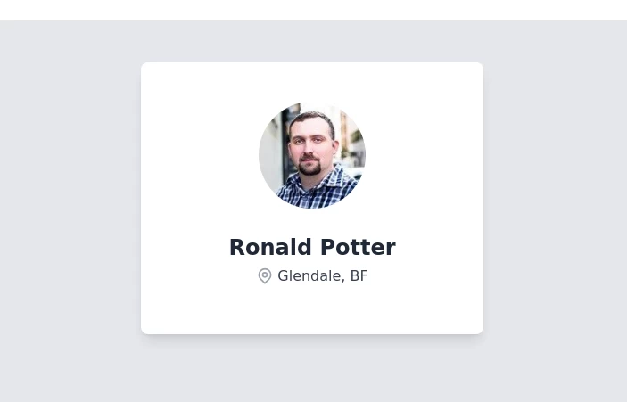 Profile Card
User Profile Card with Name and Location
1 year ago2.1k -
 Tailwind Card Components
A collection of 20+ copy-paste ready card components built with pure HTML and Tailwind CSS. Includes product cards, profile cards, article cards, pricing cards, testimonials, and notifications.
1 month ago203 -
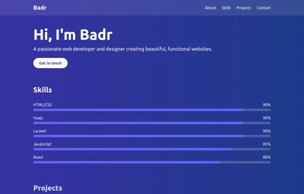 portfolio
This portfolio page for Claire includes: 1. Responsive design that works on both desktop and mobile 2. Indigo-800 and Blue-900 color scheme for the background 3. Dark mode support (the design is already dark-themed) 4. Beautiful animations and effects: 1. Fade-in and slide-up animations for sections 2. Animated skill bars 3. Hover effects on projects and buttons 4. Smooth scrolling for navigation 5. Mobile-friendly navigation with a toggle menu 6. Sections for About, Skills, Projects, and Contact 7. A contact form with styled inputs 8. Social media links in the footer 9. Accessibility considerations (proper heading structure, color contrast, focus styles) Key features: - The background uses a gradient from Indigo-800 to Blue-900 - The header and footer have a frosted glass effect using backdrop filters - Text is white for high contrast against the dark background - Sections fade in and slide up as they enter the viewport - Skill bars animate when the skills section is in view - Project cards have a hover effect with scaling and increased opacity - The contact form has animated focus states - Social media icons change color on hover - The layout is responsive, with a hamburger menu for mobile screens This implementation provides a visually appealing and functional portfolio page for Claire, using HTML, Tailwind CSS, and vanilla JavaScript for the interactions and animations.
1 year ago2k -
 Personal card
A card to show minimal info for staff member
10 months ago1.1k -
 4 months ago354
 -
 Hello Acode Master! 👋
is a passionate software developer based in Rubavu. He considers himself the top developer in the area and is committed to solving real-world problems through technology.
5 months ago716 -
 Author card
Author card for giving credit to the author of the Blog/Article. It has social media icons and user image
2 years ago7.4k -
 2 years ago11.5k


Explore components by Tags
Didn't find component you were looking for?
Search from 3000+ components