Navbar
This navbar implementation includes:
1. Responsive design that works on both desktop and mobile
2. Indigo-800 and Blue-900 color scheme for the background and accents
3. Dark mode support with a toggle button
4. Beautiful animations and effects:
1. Fade-in animation for menu items with staggered delays
2. Hover effects on menu items with underline animation
3. Smooth color transitions
4. Mobile menu slide-down animation
5. SVG icons for the dark mode toggle and mobile menu button
6. "Sign Up" call-to-action button
7. Mobile-friendly dropdown menu
8. Accessibility considerations (proper heading structure, color contrast, focus styles)
Key features:
- The background uses a gradient from Indigo-800 to Blue-900
- The navbar has a white background in light mode and dark gray in dark mode
- Text colors are adjusted for readability in both light and dark modes
- Menu items have hover effects with color changes and underline animations
- The dark mode toggle changes its icon based on the current mode
- The mobile menu slides down with a smooth animation when toggled
- Desktop menu items fade in with a staggered delay for a smooth entrance
- Dark mode is automatically applied based on system preferences
- The layout is responsive, with a hamburger menu for mobile screens
This implementation provides a visually appealing and functional navbar with various animations and effects, using HTML, Tailwind CSS, and vanilla JavaScript for the interactions.
This tailwind example is contributed by nejaa badr, on 01-Nov-2024. Component is made with Tailwind CSS v3. It is responsive. It supports dark mode.

Author nejaa badr
Related Examples
-
Responsive Navbar Example
A working example of the navbar
3 years ago17.2k -
 Modern page
hero page by salvator
9 months ago1.3k -
 2 years ago10.2k
 -
 vav bar
html , css
9 months ago1.1k -
 Flour mill website landing page template
flour mill and services template website which comprise of many sections like about us, featured products, why us, visit us
1 year ago15k -

-
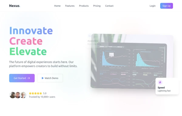
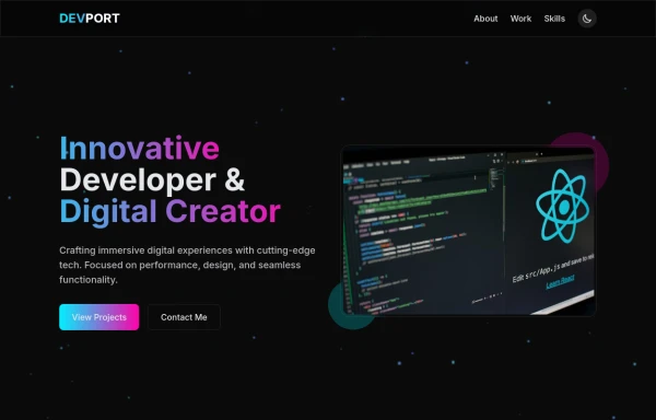 DevPort
modern portifolio by salvator
9 months ago1.3k -
 Navbar with Dropdown
Navbar with dropdown
4 months ago548 -
 hero modern
hero modern
2 months ago220 -
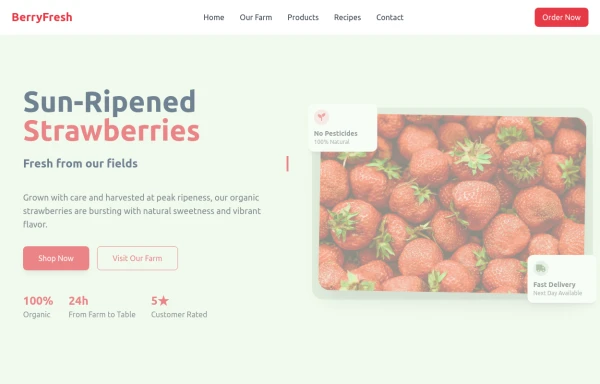 strawbery
by salvator
9 months ago967 -
 Tailwind Header
responsive mobile menu with a smooth transition
1 year ago3.7k -
 Responsive Gradient Navbar with Toggle
A modern, responsive navbar built with Tailwind CSS. Features a gradient background, flex layout, smooth hover effects, and a mobile toggle menu for optimal usability on all screen sizes.
9 months ago1.2k


Explore components by Tags
Didn't find component you were looking for?
Search from 3000+ components