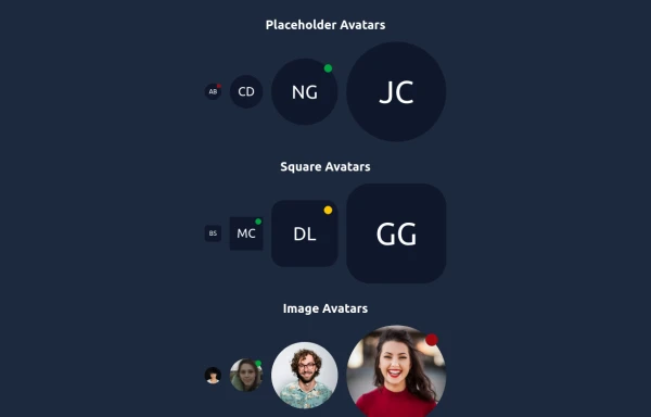
Avatar
This Avatar component includes:
1. Responsive design using Tailwind CSS classes
2. Indigo-800 and Blue-900 color scheme
3. Dark mode support
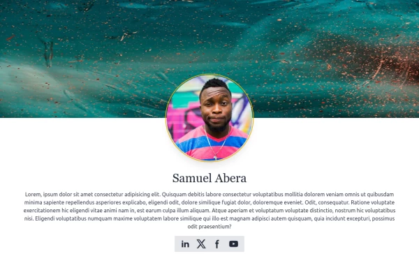
4. User avatar with hover effect and online status indicator
5. User name and role
6. Follow button with hover effect
7. Follower count
8. Subtle animations and transitions
9. Accessibility considerations (proper contrast, focus states)
Key features:
- The background uses a gradient from Indigo-800 to Blue-900
- The avatar card has a white background in light mode and dark gray in dark mode
- Text colors are adjusted for readability in both light and dark modes
- The avatar image has a border color that changes in dark mode
- The avatar has a scale effect on hover and a ring appears around it
- The Follow button uses Indigo-800 with a Blue-900 hover state
- The card has a shadow effect that changes color on hover
- Dark mode is automatically applied based on system preferences
- The entire card has a subtle transition effect for smooth color changes
- Proper focus states are implemented for the button
This design provides a clean, interactive avatar component while incorporating the requested color scheme and maintaining good usability across different devices and color modes.
This tailwind example is contributed by nejaa badr, on 31-Oct-2024. Component is made with Tailwind CSS v3. It is responsive.

Author nejaa badr
Related Examples
-
 Responsive portfolio with dark mode
responsive and support dark mode .portfolio website
1 year ago3.7k -
 2 years ago9.4k
 -
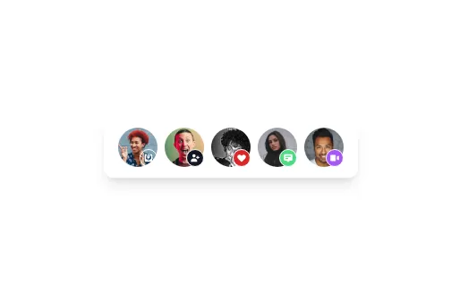
 Elegant Avatars
Useful Tailwind classes for constructing avatars with status markers. Comes with an example edit/preview avatar for the user to choose an image with the file chooser.
8 months ago463 -
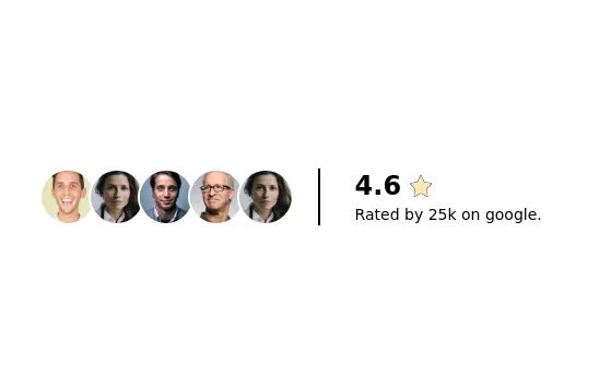 Product rating section
display star rating stats with user avatars
2 years ago11.5k -
 Shoe Card Grid
A responsive grid of three shoe cards with hover effects, featuring images, titles, descriptions, prices, and a "Shop Now" button.
7 months ago463 -
 9 months ago1.9k
 -
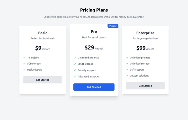 Responsive Pricing Table
can be used when you want to price
8 months ago464 -
 User Avatar
Rounded user avatar component
3 years ago10.4k -
 User Profile
User Profile
1 year ago5.7k -
 DailyDev Card
Card -based card used in the Dailydev Card, this is created to be modified to taste of each user
11 months ago1.8k -
 Avatar
Avatar
1 year ago4.8k -
 3 years ago10k


Explore components by Tags
Didn't find component you were looking for?
Search from 3000+ components