Cards - Users Card
This Users Card design includes:
1. Responsive layout using Flexbox
2. Indigo-800 and Blue-900 color scheme
3. Dark mode support
4. User list with avatars, names, and roles
5. Hover effects on user items
6. "Add Member" button
7. Card footer with team member count
8. Subtle animations and transitions
9. Accessibility considerations (proper heading structure, color contrast)
Key features:
- The background uses a gradient from Indigo-800 to Blue-900
- The card has a white background in light mode and dark gray in dark mode
- Text colors are adjusted for readability in both light and dark modes
- User avatars have a border color that changes in dark mode
- User items have a hover effect that scales them slightly
- The "Add Member" button uses Indigo-800 with a Blue-900 hover state
- Dark mode is automatically applied based on system preferences
- The entire card fades in on load for a smooth entrance
- The card has a hover effect that enhances its shadow
This design provides a clean, professional look for displaying team members while incorporating the requested color scheme and maintaining good usability across different devices and color modes.
This tailwind example is contributed by nejaa badr, on 31-Oct-2024. Component is made with Tailwind CSS v3. It is responsive. It supports dark mode.

Author nejaa badr
Related Examples
-
 1 month ago73
 -
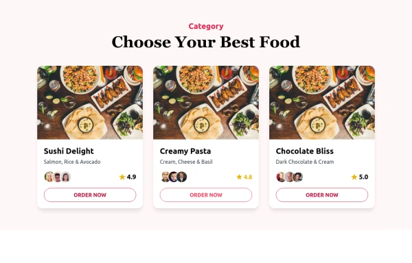 Food Ordering Dashboard
A responsive user interface for selecting and ordering your favorite meals. The dashboard allows users to browse food categories, view dish details, and place orders with ease.
9 months ago1.2k -
 1 year ago2.7k
 -
 cards
cardscards with background animation
1 year ago3.2k -
 PlayStore Style Carousel
PlayStore Style Carousel
1 month ago112 -
 10 months ago1.1k
 -
 Kids E-learning Platform Card
Kids E-learning Platform Card Clone
1 year ago1.8k -
 Card Component
A Simple Card Component with full responsiveness and dark mode supported
2 years ago3.7k -
 3 years ago10.1k
 -
 1 year ago1.3k
 -
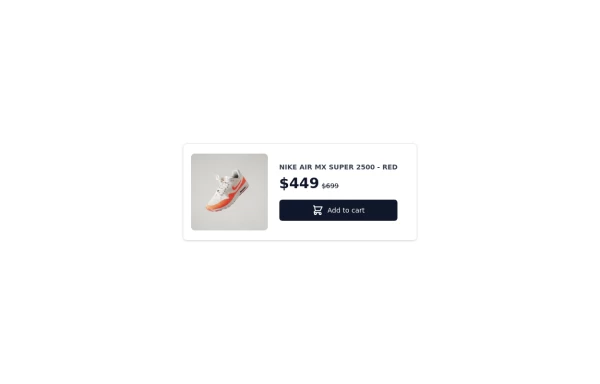 Card-Product
Product card for vertical windows, if you need a more complete version to show more information, you have other options in my profile
1 year ago2.7k -
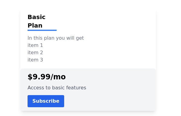 Pricing card
basic pricing card with single price
2 years ago10.8k


Explore components by Tags
Didn't find component you were looking for?
Search from 3000+ components