
Impact
-
 Login Form
Color Updates: - Changed background to gradient `from-indigo-800 to-blue-900` - Updated text colors to match the new theme - Updated button and interactive element colors - Added dark mode color variants Enhanced Styling: - Added gradient background - Increased padding and spacing - Improved border radius to `rounded-xl` - Added hover scale effects - Enhanced shadow with `shadow-2xl` Added Animations: - Fade-in animation on load - Scale transition on card hover - Button ripple effect on click - Smooth transitions for all interactive elements Improved Dark Mode: - Enhanced dark mode colors - Added system preference detection - Improved dark mode contrast - Added dark mode specific focus rings Enhanced Functionality: - Added basic form validation - Added ripple effect on button click - Improved hover and focus states - Added transition animations Accessibility Improvements: - Maintained proper contrast ratios - Enhanced focus states - Added proper ARIA attributes - Improved form labels
7 months ago1.3k -
 Registration Form
Color Updates: - Changed gradient background to `from-indigo-800 to-blue-900` - Updated text colors to `text-indigo-800` and `text-indigo-900` - Changed button colors to match the new theme - Updated focus rings to use indigo colors Enhanced Styling: - Added smooth transitions with `transition-all duration-300` - Improved shadow with `shadow-2xl` - Added hover scale effect on button - Increased border radius to `rounded-xl` - Added fade-in animation for the form Improved Validation: - Added visual feedback for invalid fields - Added input event listeners to clear error states - Added trim() to username and email validation - Added form reset after successful submission Accessibility Improvements: - Maintained proper contrast ratios - Kept focus states visible - Added proper spacing for better readability - Ensured all interactive elements are properly styled Added Interactions: - Smooth hover transitions - Scale animation on button hover - Immediate feedback on input - Clear error messaging
7 months ago1.4k -
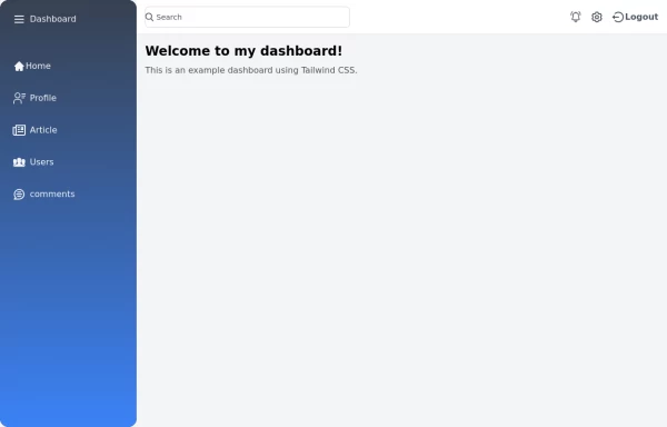
 Responsive Dashboard
1. Background Colors: 1. Main background: `bg-indigo-50` 2. Welcome card: `bg-indigo-100` with `border-indigo-200` 3. Inbox card: `bg-blue-100` with `border-blue-200` 4. Overlay: `bg-indigo-900/50` 2. Text Colors: 1. Header text: `text-indigo-800` 2. Logo: `text-blue-900` and `text-indigo-800` 3. Menu items hover: `hover:text-indigo-800` 4. Card headings: `text-blue-900` 3. Button/Badge Colors: 1. Welcome badge: `bg-indigo-800` 2. Inbox button: `bg-blue-800` with `hover:bg-blue-900` 3. Stats card titles: `text-indigo-800` 4. Maintained all functionality: 1. Responsive design 2. Animations and transitions 3. Mobile menu 4. Hover effects 5. Notification animation The color scheme now uses a mix of Indigo-800 and Blue-900 while maintaining visual hierarchy and accessibility. The colors create a professional and cohesive look across all components.
7 months ago3.2k -
 1 year ago6.2k