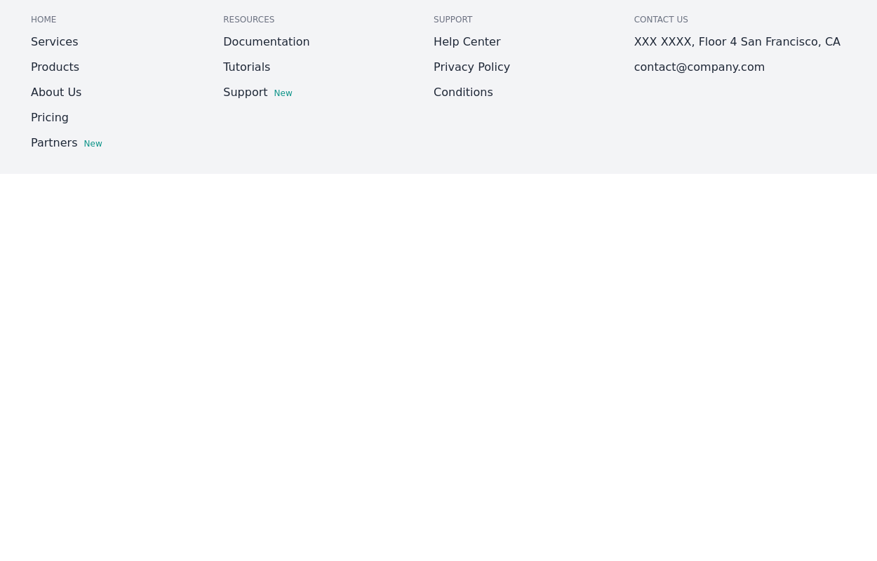
Simple centered footer
Use this example for simple footer with horizontal sitemap links, brand logo, and social media accounts.This example can also be used as a tailwind sticky footer.
This tailwind example is contributed by Pagedone, on 02-May-2024. Component is made with Tailwind CSS v3. It is responsive.

Author Pagedone
Related Examples
-
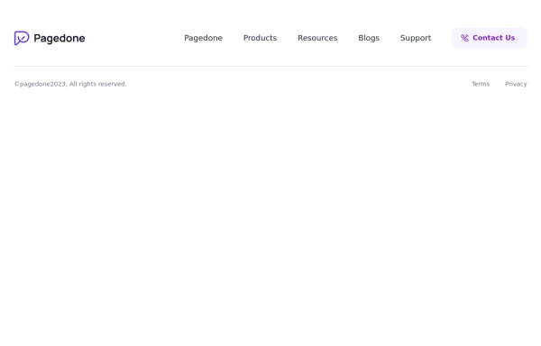 Simple footer with CTA Button
You can use this simple footer as a base for any type of websites. It includes a single CTAs button that you can customize according to your requirement.
1 year ago1.9k -
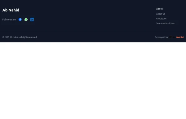 Footer
Elevate your website design with this sleek and minimalist light mode footer component by AB NAHID AGENCY. Crafted for clean UI experiences, it’s perfect for modern web apps, blogs, and business platforms. Easy to integrate, fully responsive, and built with scalability in mind—designed to blend seamlessly with any light-themed layout.
4 months ago525 -
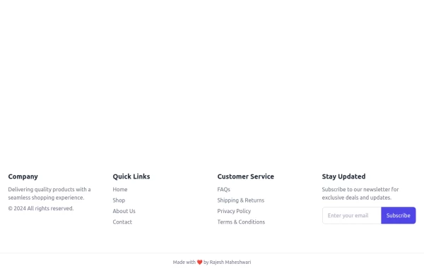 Footer
Footer with responsive desing
9 months ago1.1k -
 1 year ago3k
 -
 1 year ago1.9k
 -
 2 years ago11.4k
 -
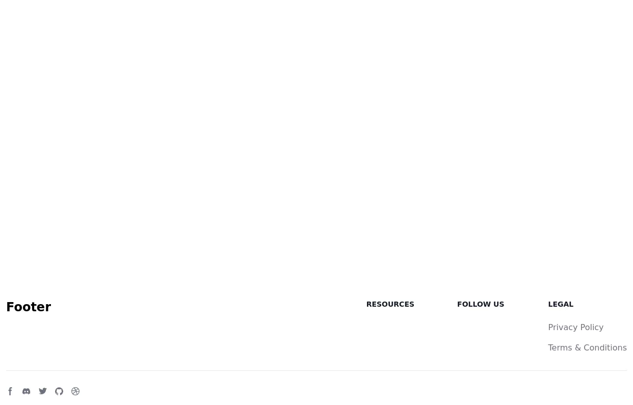
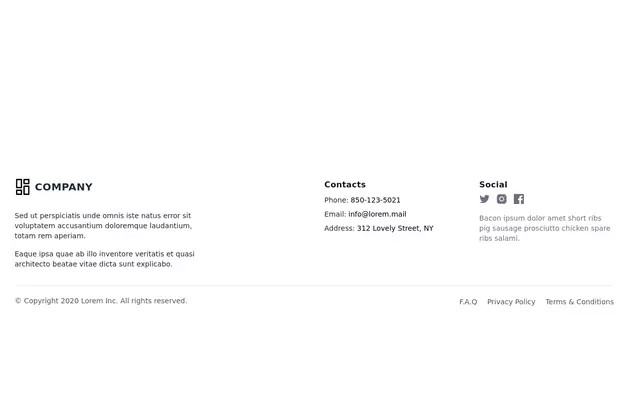
 Responsive footer
Footer section with icons
2 years ago12.5k -
 Responsive Footer
source: https://kitwind.io/products/kometa/components/footers
3 years ago16.4k -
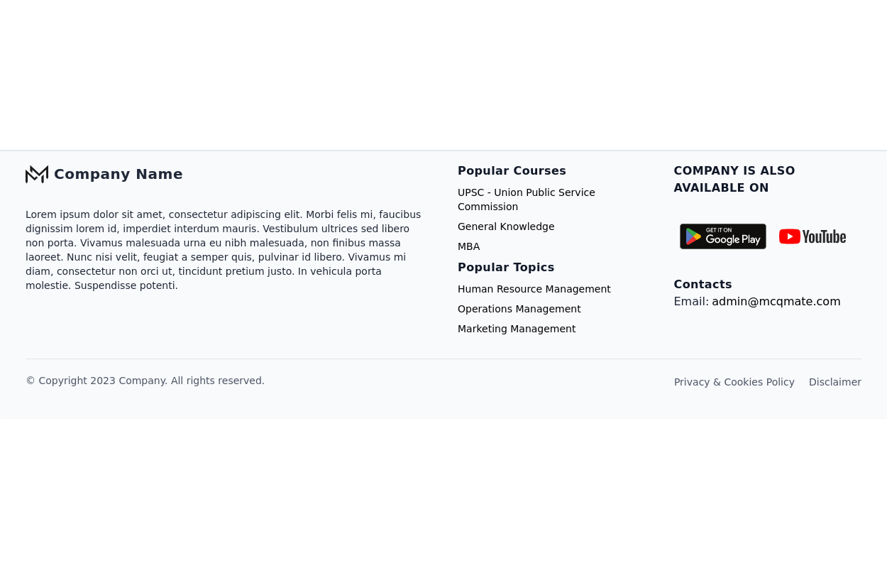
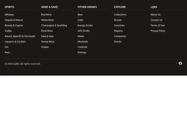 Footer with mobile accordion
A modern dark-themed footer component built with Tailwind CSS, featuring a responsive 5-column grid layout for desktop that transforms into an accordion menu on mobile devices. Perfect for beverage, e-commerce, or corporate websites, it includes organized navigation categories, hover effects on links, social media integration, and a clean copyright section - all styled with a professional stone-gray color scheme.
10 months ago1.2k -
 Footer for blog
https://github.com/tailwindow/component
3 years ago18.1k -
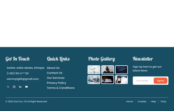
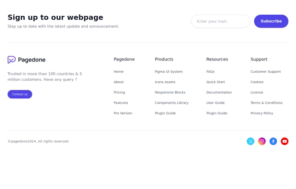 Pre-footer Newsletter
Use this example with a Newsletter section before the footer, a sitemap, the logo of your brand and social media accounts.
1 year ago2.8k -
 home page
Hero Section: Gradient background with noise texture Animated floating image Gradient text effect Call-to-action buttons Features Section: Three feature cards with gradient headers Hover animations Clean iconography Stats Display: Full-width gradient background Clean stat presentation Testimonials: Three testimonial cards with user avatars Star ratings Border accents Hover scaling effects Call-to-Action (CTA) Section: Gradient background Centered content Multiple action buttons Footer: Four-column layout Social media icons Newsletter signup Copyright information Design Features: Vibrant gradient color scheme Smooth hover animations and transitions Responsive layout for all screen sizes Modern typography Subtle floating animations Clean, card-based design
6 months ago849


Explore components by Tags
Didn't find component you were looking for?
Search from 3000+ components