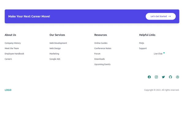
Centered footer with CTA
Use this Tailwind CSS footer compoent for simple footer with center aligned everything and with CTA buttons.
This tailwind example is contributed by Pagedone, on 02-May-2024. Component is made with Tailwind CSS v3. It is responsive. similar terms for this example are CTA,banner

Author Pagedone
Related Examples
-
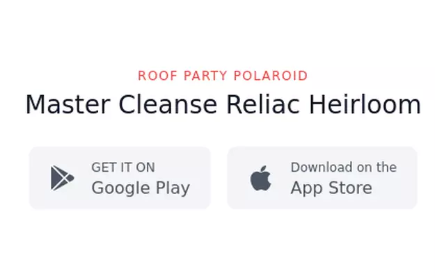
 Call to Action (for app stores)
Download app section with Playstore and Appstore button
3 years ago11.6k -
 3 years ago11.6k
 -
 3 years ago10.3k
 -
 Clean & Responsive Footer Design with Tailwind CSS With CTA Button
modern and responsive footer built with Tailwind CSS to enhance website navigation, accessibility, and user experience. Featuring quick links, social media icons, copyright info, and a sleek layout, this SEO-friendly footer improves engagement and usability across all devices. Perfect for portfolios, business websites, and eCommerce stores!
11 months ago1.1k -
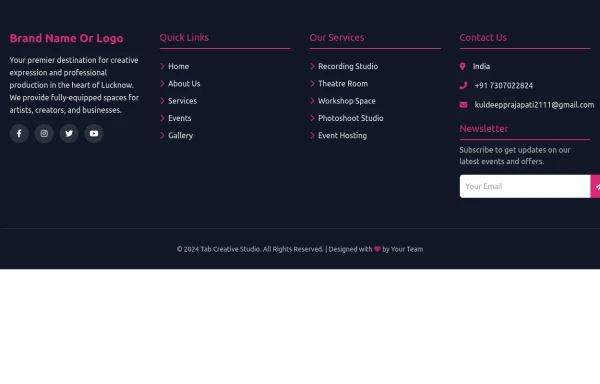
 Modern Dark Footer with Overlapping Gradient CTA
A comprehensive, dark-themed website footer component built with HTML and Tailwind CSS. It features a visually distinct overlapping section with a colorful gradient background containing a prominent call-to-action (CTA) block. The main footer area utilizes a multi-column grid layout for organized navigation links, a newsletter signup form, and social media icons. A final bottom bar includes legal links and copyright information. The design is responsive and adapts its layout for different screen sizes.
10 months ago1.1k -
 Footer
A footer is a critical part of any professional website. A footer ensures your website is complete, professional, user-friendly, and legally compliant. It's where users go for answers when they're done scrolling.
8 months ago1k -
 e-commerce website landing page template with Tailwind CSS.
A clean, responsive e-commerce & blog template built with Tailwind CSS. Features light/dark mode, dynamic featured posts, hero, CTA, and SEO-ready sections.
2 months ago523 -
 GamingOnline
used to pray game online
3 months ago640 -
 Solo leveling
Animation & movie field,videos,games.
9 months ago931 -
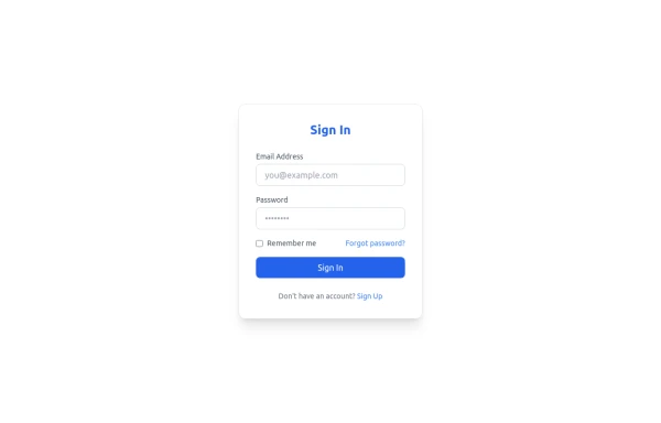 Sign In Form
Clean and modern Sign In form with email, password, and "Forgot password" link. Fully responsive and styled with Tailwind CSS, perfect for SaaS platforms.
8 months ago797 -
 3 years ago12.4k
 -
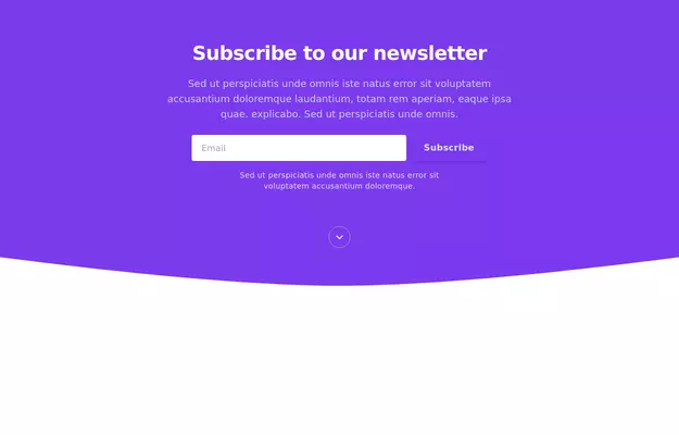
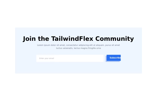 Modern responsive Newsletter form
Responsive newsletter subscriber form
1 year ago2.9k


Explore components by Tags
Didn't find component you were looking for?
Search from 3000+ components