Footer version Ousmane
Ce footer est associer a un menu de navigation qui apparait sous le mobile donc avec sa plus besoin de gerer les menus sous le mobile.
This tailwind example is contributed by Ousmane CISSE, on 23-Oct-2025. Component is made with Tailwind CSS v3. It is responsive.

Author Ousmane CISSE
Related Examples
-
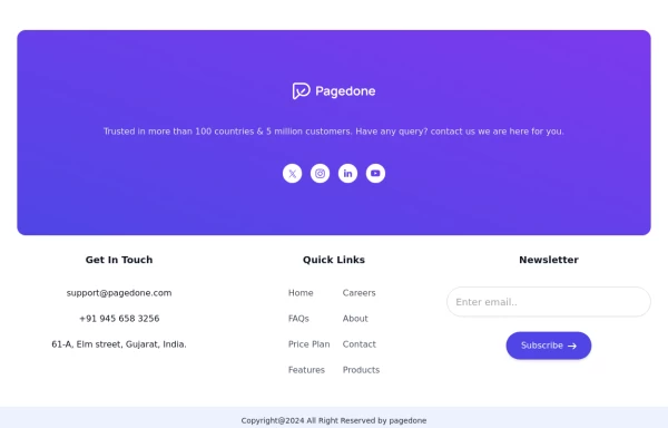
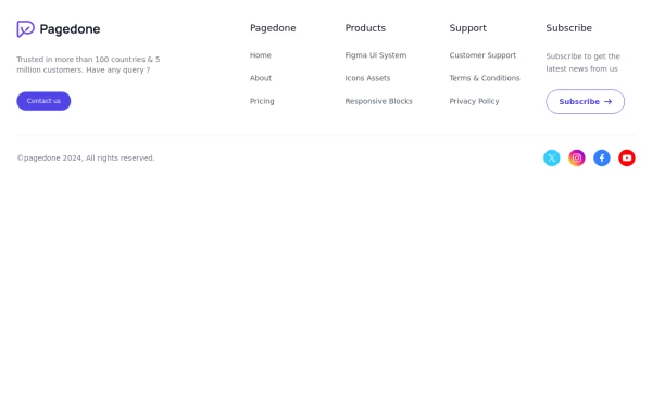 Five columns with subscribe button
This example of tailwind css footer can be used if you want five columns in your footer with brand logo, sitemap links, description and social media account with additional subscibe button to connect with your website.
1 year ago2.6k -
 Crafting a Responsive Footer with TypeScript, and Tailwind CSS
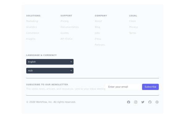
This is a well-structured and comprehensive footer section that uses Tailwind CSS for styling and layout. Here’s a brief explanation of what each part does: Footer Container (<footer class="bg-gray-800">): The footer is wrapped in a <footer> element with a dark background using the bg-gray-800 class. The aria-labelledby="footer-heading" attribute is used for accessibility, linking the <footer> to the invisible heading (<h2 id="footer-heading" class="sr-only">Footer</h2>). Main Content Area: The content inside the footer is centered and spaced using utility classes like max-w-7xl mx-auto py-12 px-4 sm:px-6 lg:py-16 lg:px-8. Footer Sections: The footer is divided into several sections using grid layouts (xl:grid xl:grid-cols-5 xl:gap-8), which organize content into columns. Each section (Solutions, Support, Company, Legal) contains a heading with a list of links. These links are styled with Tailwind classes for consistent spacing and hover effects (text-base text-gray-300 hover:text-white). Language & Currency Selector: This section provides dropdowns for selecting language and currency. Tailwind's form utilities (@tailwindcss/forms plugin) are used to style the select elements. Newsletter Subscription Form: A subscription form is provided with an email input and a submit button. The form is styled to be responsive, with focus states for accessibility (focus:ring-2 focus:ring-offset-2). Social Media Links: Social media icons (Facebook, Instagram, etc.) are included, each wrapped in a link with hover effects. Icons are created using SVGs, which are scalable and look sharp at any size. Final Section: The footer concludes with another grid layout, ensuring spacing and alignment for different screen sizes. Customization Tips: Colors: You can easily customize the colors using Tailwind's utility classes (e.g., bg-gray-800, text-gray-400) to match your design. Icons: Replace SVGs with the appropriate icons for your needs. You might use a different icon set or add more icons. Responsive Design: Tailwind's utility classes like sm:, md:, lg:, xl: ensure that the footer is responsive across devices. Adjust the layout or padding if needed. Additional Considerations: SEO: Ensure the links in the footer point to meaningful pages to improve SEO. Accessibility: Consider adding aria-labels to the form elements and social media links to enhance accessibility further. This footer is ready to be integrated into a Tailwind CSS-powered project, offering both aesthetic appeal and functional utility.
1 year ago3.1k -
 Basic footer
Basic footer with subscribe to the newsletter section
3 years ago9.8k -
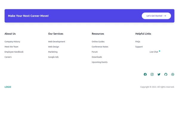
 Simple footer with CTA Button
You can use this simple footer as a base for any type of websites. It includes a single CTAs button that you can customize according to your requirement.
1 year ago2.1k -
 canvas fully covers
canvas fully covers
9 months ago926 -
 Footer
Simple Dark footer
7 months ago824 -
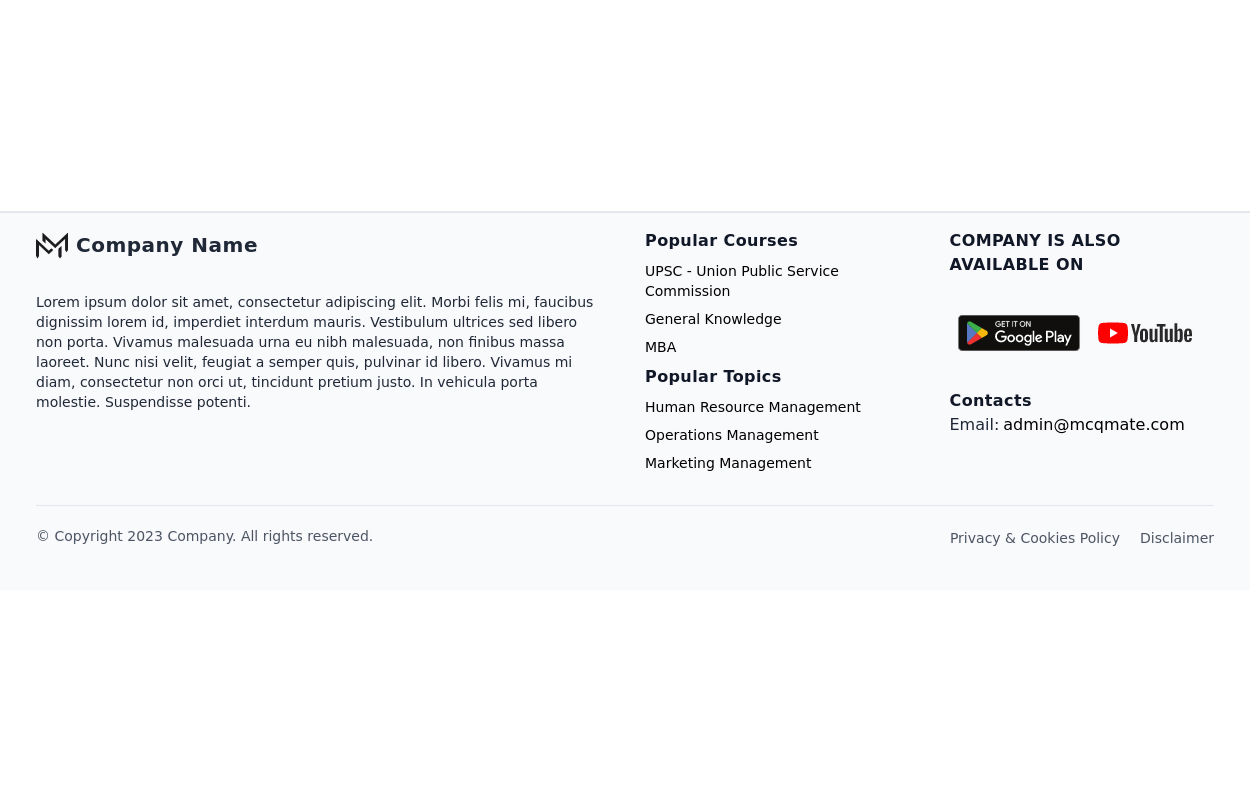
 Newsletter with address location
Use this example to first show brand logo card, then show address locations of your company, a newsletter sign-up form.
1 year ago3k -
 Tailwind Footer with dark version
This example can be used if you are looking for four column footer in dark version with sitemap links, brand logo, and social media accounts.
1 year ago3.6k -
 Responsive footer
Footer section with icons
3 years ago12.6k -
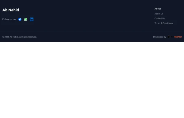 Footer
Elevate your website design with this sleek and minimalist light mode footer component by AB NAHID AGENCY. Crafted for clean UI experiences, it’s perfect for modern web apps, blogs, and business platforms. Easy to integrate, fully responsive, and built with scalability in mind—designed to blend seamlessly with any light-themed layout.
7 months ago703 -
 Clean & Responsive Footer Design with Tailwind CSS With CTA Button
modern and responsive footer built with Tailwind CSS to enhance website navigation, accessibility, and user experience. Featuring quick links, social media icons, copyright info, and a sleek layout, this SEO-friendly footer improves engagement and usability across all devices. Perfect for portfolios, business websites, and eCommerce stores!
11 months ago1.1k -
 Horizontal footer
Use this horizontal footer tailwind css example if you want horizontal footer layout side by side, which includes sitemap links, brand logo and social media accounts.
1 year ago2.9k


Explore components by Tags
Didn't find component you were looking for?
Search from 3000+ components