machine
A fully interactive, web-based macOS-style desktop environment featuring draggable and resizable windows, a dynamic Dock with magnification, smooth glass UI effects, adaptive colors, a functional photo gallery with hover menus, and integrated mini-apps like Safari, Notes, Weather, and App Store. Built using HTML, CSS, Tailwind, and JavaScript to recreate a modern OS experience directly in the browser.
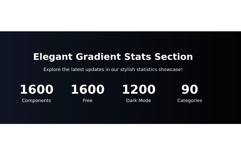
This tailwind example is contributed by Gidy Official, on 18-Nov-2025. Component is made with Tailwind CSS v3. It is responsive. It supports dark mode. similar terms for this example are Info, Show info, Statistics

Author Gidy Official
Related Examples
-
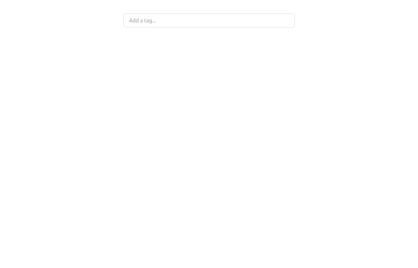 Tag Input field
This code creates a dynamic tag input field using HTML, JavaScript, and TailwindCSS. Users can type tags into the input field and press "Enter" to add them. Each tag is displayed inside the input field as a styled container with a remove button. The tag input is limited to a maximum of 5 tags, and an error message is shown if the limit is exceeded. Users can remove tags to free up space for new ones. The input field and tags are styled using TailwindCSS, ensuring a clean and responsive design.
1 year ago2.1k -
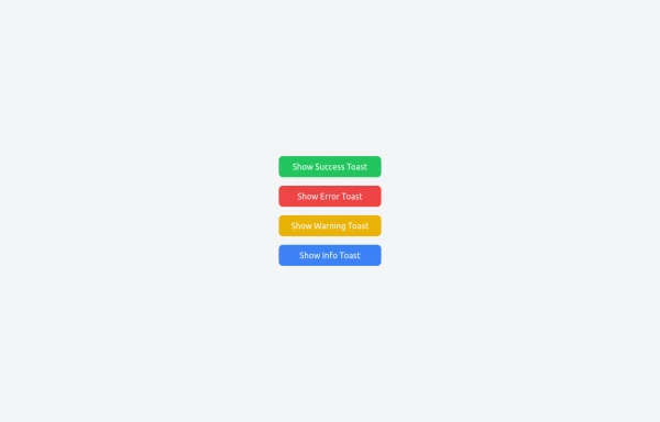 Notifications
Toast Notifications are lightweight and customizable components for displaying short messages or alerts. They are perfect for feedback on user actions, such as form submissions or system updates. Supports different types of notifications (success, error, warning, info). Automatically hides after a specified timeout. Option to include action buttons or close icons. Customizable styles, animation, and position on the screen.
1 year ago1.4k -
 machine
tell you how your MAC pc work
4 months ago342 -
 Landi page template
con un cuerpo libre
2 months ago280 -
 Engineering Project Dashboard
Track engineering assignments, project progress, technology stack, and delivery timelines in one simple dashboard.
1 week ago86 -
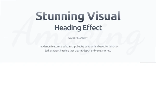 Heading
Subtle Script Background - Large, very light script font in the background ("Amazing") Light-to-Dark Gradient Heading - Main heading fades from light gray to dark gray Layered Typography - Secondary heading in medium weight for contrast Elegant Divider - With centered italic text Minimalist Border Accents - Thin borders in corners for sophistication Responsive Design - Scales beautifully on all devices
9 months ago727 -
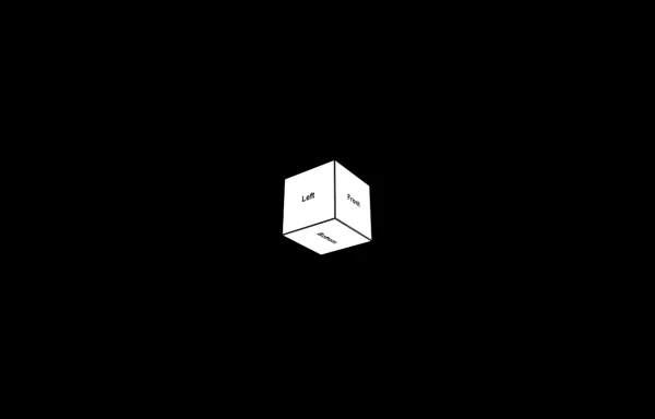 3d Box
Let's build a 3d world empowered by Orgin Dreams.these are 3d objects
10 months ago835 -
 Rwandan farmers with Canadian markets through sustainable, fair trade practices.
Key Features of This Website: Professional Design: Clean, modern interface with orange/green color scheme representing mangoes and agriculture Fully responsive layout that works on all devices Comprehensive Sections: Hero section highlighting the Rwanda-Canada mango trade Product showcase with different mango varieties Current market pricing table Detailed farm-to-table process explanation Company information and impact metrics Testimonials from partners Contact form and information Trade-Specific Content: Focus on Rwandan mango varieties suitable for Canadian markets Pricing in both USD and kg units common in agricultural trade Information about certifications and compliance Shipping and logistics details User Experience: Clear calls-to-action for quotes and orders Easy navigation between sections Newsletter signup for market updates Contact information prominently displayed Trust Elements: Certifications and compliance badges Impact statistics showing benefits to Rwandan farmers Testimonials from Canadian partners
9 months ago1.2k -
 Horizon Premium Dashboard Tailwind
Website Dashboard Admin with tailwind CSS CDN
1 month ago259 -
 1 year ago2k
 -
 2 years ago18.7k
 -
 cards
cardscards with background animation
1 year ago3.2k


Explore components by Tags
Didn't find component you were looking for?
Search from 3000+ components