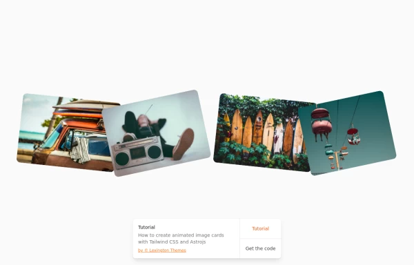
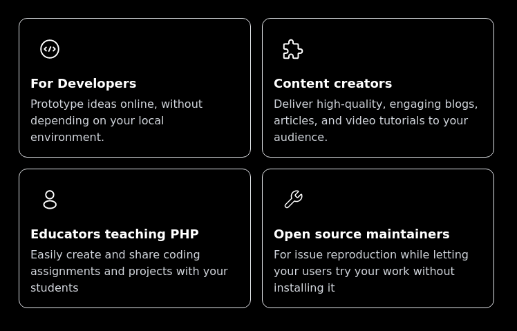
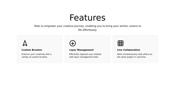
Animated cards
This tailwind example is contributed by Michael Andreuzza, on 27-Apr-2024. Component is made with Tailwind CSS v3. It is responsive. It supports dark mode. similar terms for this example are Services,Why choose us,Transitions

Author Michael Andreuzza
Related Examples
-
 3 years ago29.3k
 -
 1 year ago12.1k
 -
 1 year ago5.3k
 -
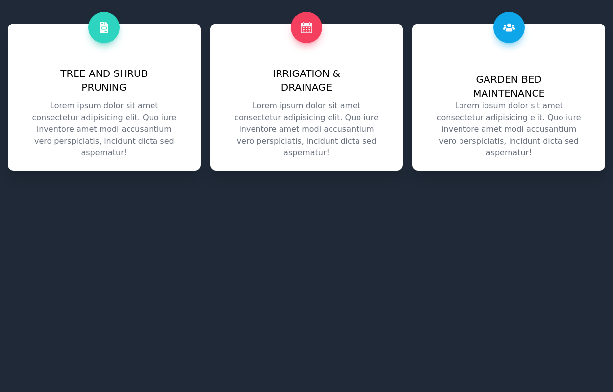
 Responsive Card Grid
Tailwind CSS responsive grid for feature listing. The cards have a teal background, rounded corners, and a concise display of feature titles, descriptions, and a "Learn More" link.
3 years ago52.3k -
 3 years ago13.8k
 -
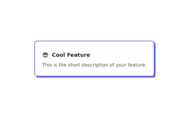 Feature Card
Elevated card
3 years ago10.6k -
 Features cards section
Features cards section with dark theme
3 years ago10.6k -
 3 years ago10.2k
 -
 2 years ago17.3k
 -
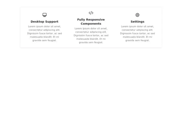 Responsive Features Section
It's a Handy Ready to Use Responsive Features or Services Component with Dark Mode
2 years ago5.3k -
 1 year ago3k
 -
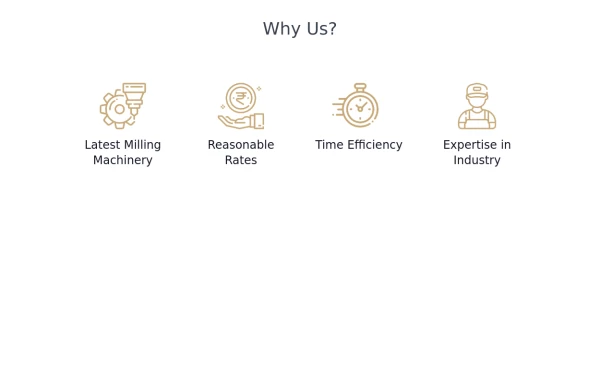 Why Us section with hover animation
Why to choose us section, responsive and hove animation
1 year ago5.2k


Explore components by Tags
Didn't find component you were looking for?
Search from 3000+ components