countdown with Tailwind CSS and Alpinejs
This tailwind example is contributed by Michael Andreuzza, on 27-Apr-2024. Component is made with Tailwind CSS v3. It is responsive. similar terms for this example are Services,Why choose us,Timer,Time counter

Author Michael Andreuzza
Related Examples
-
 11 months ago1.1k
 -
 Flour mill website landing page template
flour mill and services template website which comprise of many sections like about us, featured products, why us, visit us
1 year ago15.1k -
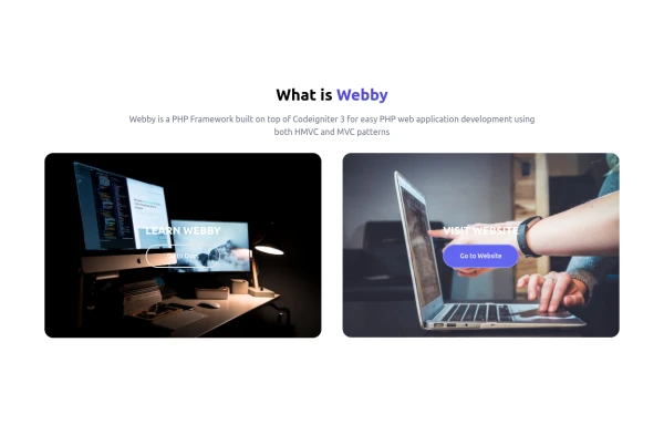 What is Webby
Webby is a PHP Framework built on top of Codeigniter 3 for easy PHP web application development using both HMVC and MVC patterns.
1 year ago2.3k -
 1 month ago35
 -
 1 year ago1.4k
 -
 3 years ago11.3k
 -
 counter compteur
counter compteur
4 months ago270 -
 1 year ago5.3k
 -
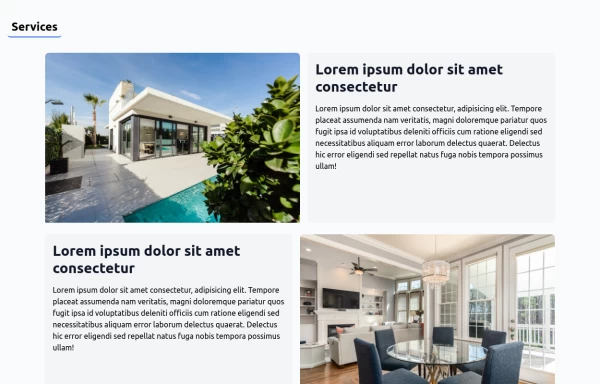 House Cleaning Website Services Section
House Cleaning Website Services Section Photo by @candjstudios & @framesforyourheart on Unsplash
1 year ago7.6k -
 Attractive Feature Section
With Gradient Color 6 Features
8 months ago909 -
 Feature Showcase
The feature showcase's responsive grid can also be used as testimonial cards.
3 years ago25.8k -
 1 year ago3.1k


Explore components by Tags
Didn't find component you were looking for?
Search from 3000+ components