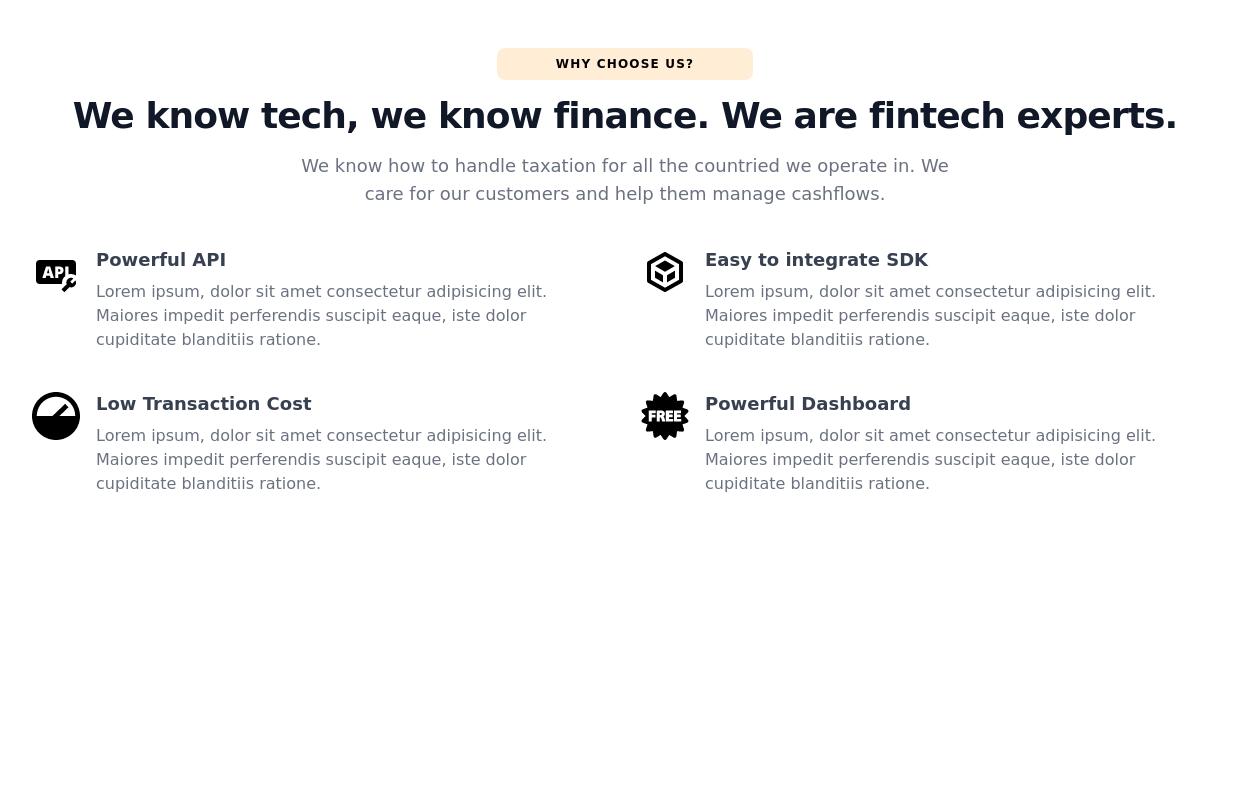
Tailwind css feature cards
This tailwind example is contributed by Kofi Osei, on 06-Jan-2023. Component is made with Tailwind CSS v3. It is responsive. similar terms for this example are Services,Why choose us

Author Kofi Osei
Related Examples
-
 2 years ago14.5k
 -
 2 years ago17.1k
 -
 3 years ago11.1k
 -
 3 years ago14.2k
 -
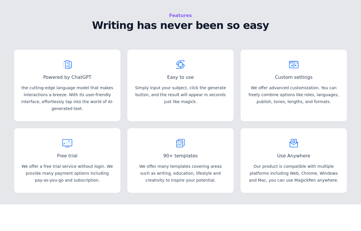
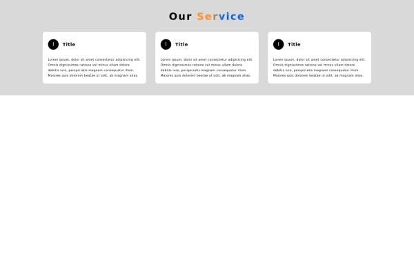
 Feature cards for company website
Each card provides a brief description of a specific feature, making it easy for users to understand the benefits and capabilities of our services
2 years ago7.5k -
 1 year ago2.9k
 -
 Portfolio with buttons
Portfolio with buttons. Portfolio item has image, title and description.
1 year ago4k -
 Facts
FactsLarge fact counters with the "centered" title, a quarter overstand to the right site. Die JS-Line set the titles, so you only have to change the text -- and or modify the counters- or the titles background-color. [VIEW-NOTICE] If you change the from XS over MD to XL ... right-click here into the showcase and click "reload frame" or test it on you own site directly.
1 year ago2k -
 2 years ago17.2k
 -
 free tailwind personal portfolio template
free tailwind personal portfolio template
2 years ago5.5k -
 1 year ago2.1k
 -
 2 years ago12.3k


Explore components by Tags
Didn't find component you were looking for?
Search from 3000+ components