Footer
A simple footer with link adjustment for smartphones
This tailwind example is contributed by Matti, on 02-Dec-2024. Component is made with Tailwind CSS v3. It is responsive. It supports dark mode.

Author Matti
Related Examples
-
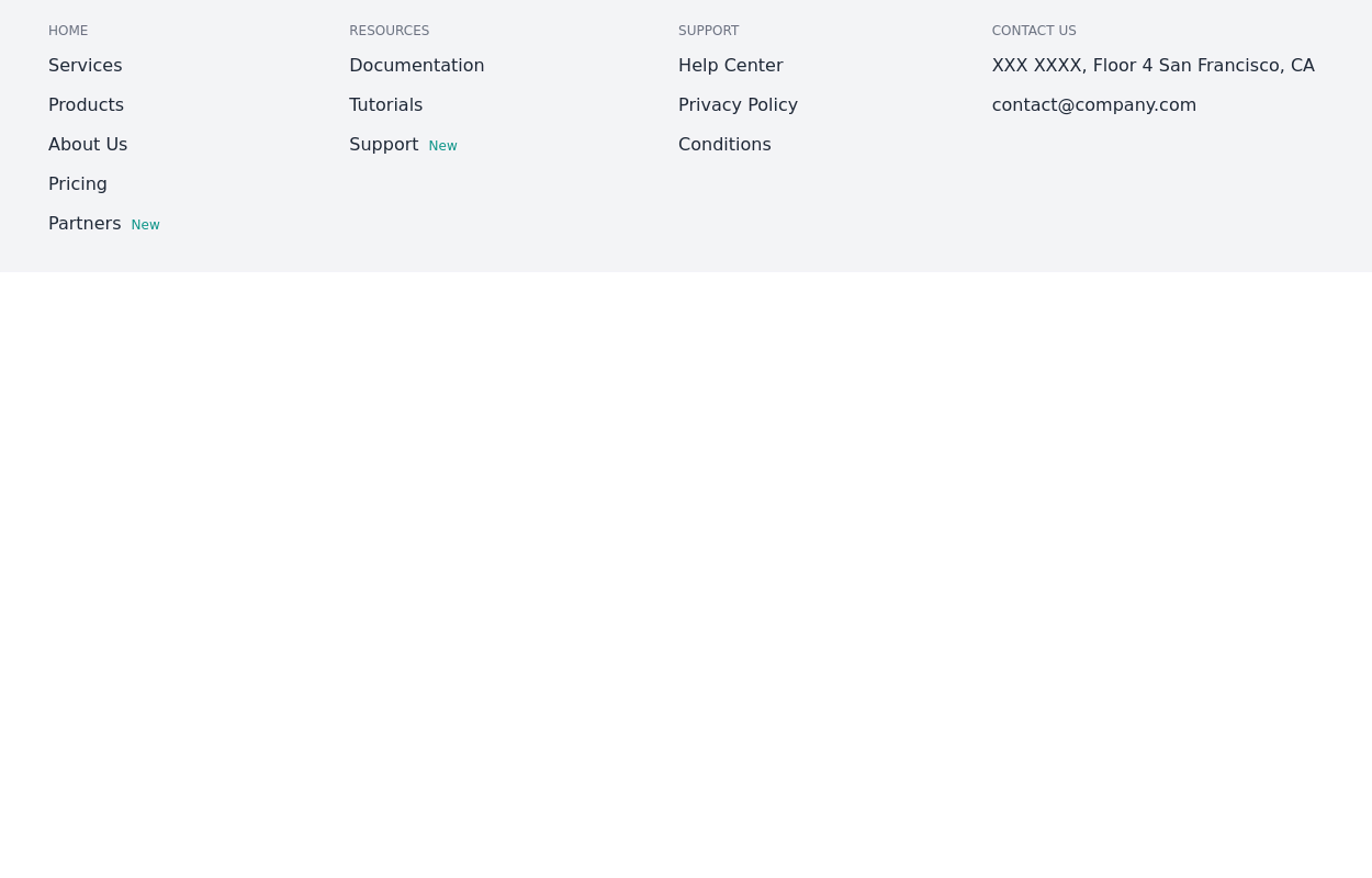
 Footer
responsive footer
2 years ago8.8k -
 Default Tailwind Footer
Use this example of a footer section divided in five columns with brand logo, desciption, sitemap links and social media accounts.
1 year ago3k -
 Dark Footer with subscribe form
Use below exmaple of Tailwind CSS Dark Footer with Newsletter Subscription Form with brand logo and site links.
1 year ago2.9k -
 Centered footer with subscribe form
Use this example to center align everything in footer with brand logo, sitemap links and subscribe form.
1 year ago2.7k -
 3 years ago11.7k
 -
 11 months ago2.3k
 -
 3 years ago16.2k
 -
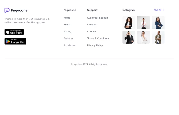 Footer with gallery
Use this example if you want to add gallery of images into your footer with brand logo, sitemap links and copyright notice.
1 year ago2.6k -
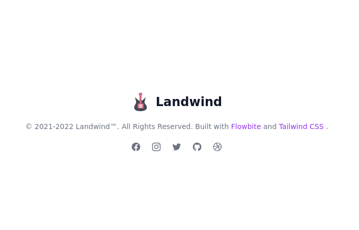
 Basic footer
Basic footer with subscribe to the newsletter section
3 years ago9.8k -
 3 years ago13.6k
 -
 Footer - Htmlwind
Simple centerd footer
9 months ago670 -
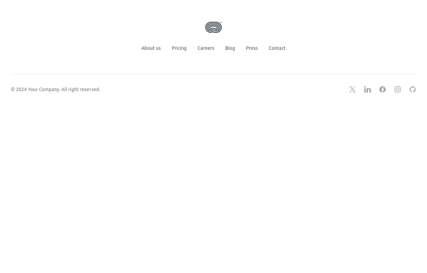
 Simple centered footer
Use this example for simple footer with horizontal sitemap links, brand logo, and social media accounts.This example can also be used as a tailwind sticky footer.
1 year ago3k


Explore components by Tags
Didn't find component you were looking for?
Search from 3000+ components