Footer
responsive footer
This tailwind example is contributed by Aman kumar, on 01-Feb-2024. Component is made with Tailwind CSS v3. It is responsive. It supports dark mode.

Author Aman kumar
Related Examples
-
 Footer for blog
https://github.com/tailwindow/component
3 years ago18.6k -
 3 years ago16.6k
 -
 Responsive footer
Footer section with icons
3 years ago12.6k -
 1 year ago3.9k
 -
 3 years ago11.8k
 -
 Call to Action (for app stores)
Download app section with Playstore and Appstore button
3 years ago11.8k -
 Newsletter with address location
Use this example to first show brand logo card, then show address locations of your company, a newsletter sign-up form.
1 year ago3k -
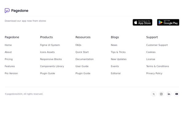 Footer with App buttons
This example can be used if you want add your app buttons of store for download with brand logo, sitemap links and social media accounts.
1 year ago2.7k -
 less is more
less is more by salvator
9 months ago1.1k -
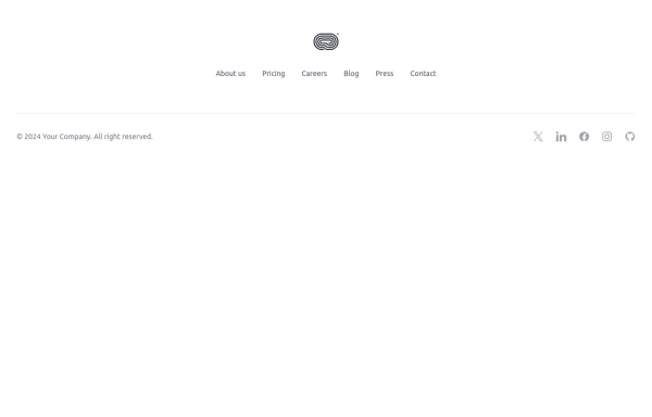 Footer - Htmlwind
Simple centerd footer
9 months ago671 -
 beautifull footer
We create a Advance animated footer section using tailwindcss and custom css
1 year ago2.5k -
 1 year ago1.8k


Explore components by Tags
Didn't find component you were looking for?
Search from 3000+ components