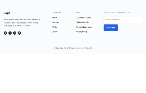
Centered footer with subscribe form
Use this example to center align everything in footer with brand logo, sitemap links and subscribe form.
This tailwind example is contributed by Pagedone, on 02-May-2024. Component is made with Tailwind CSS v3. It is responsive.

Author Pagedone
Related Examples
-
 3 years ago12.5k
 -
 3 years ago14.8k
 -
 9 months ago1.9k
 -
 1 year ago3.4k
 -
 7 months ago510
 -
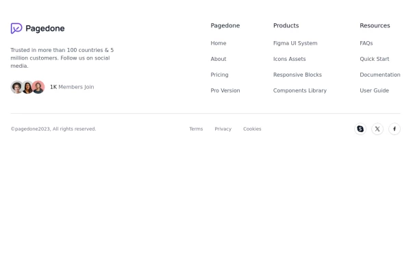 Footer with Member info
Use below footer tailwind template which show number of member who joins the community.
1 year ago2.3k -
 10 months ago1.2k
 -
 Responsive Footer
source: https://kitwind.io/products/kometa/components/footers
3 years ago16.6k -
 Call to Action (for app stores)
Download app section with Playstore and Appstore button
3 years ago11.5k -
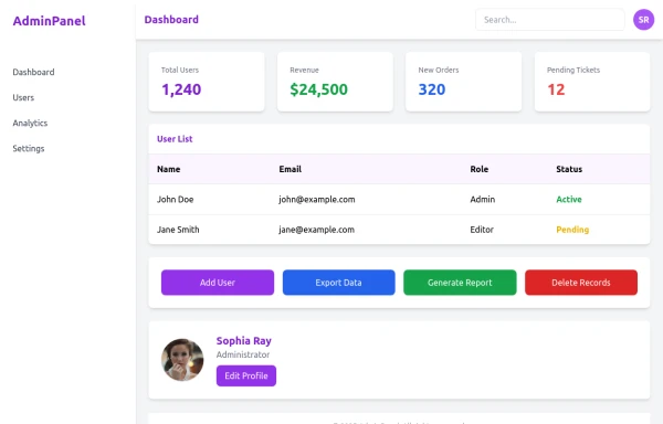 admin panel UI
Premium Admin Panel Pack including sidebar navigation, top navbar, dashboard cards, user tables, quick actions, profile section, and footer. Fully responsive with modern clean design using Tailwind CSS.
7 months ago1.8k -
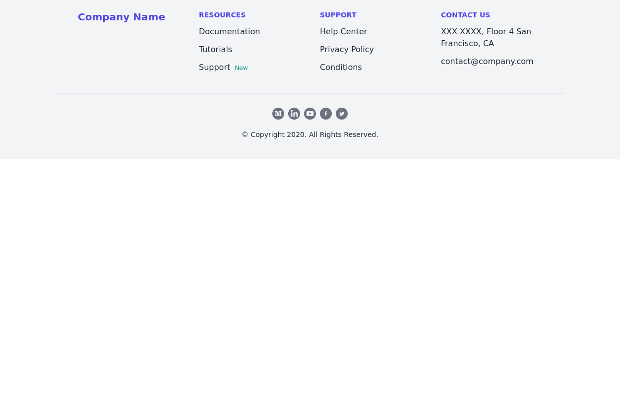
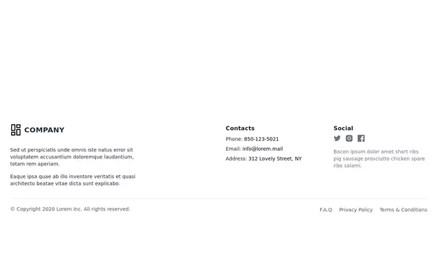
 Footer with social media icons
If you want to use colorful social media icons with address location, sitemap links and newsletter.
1 year ago3.5k -
 3 years ago16k


Explore components by Tags
Didn't find component you were looking for?
Search from 3000+ components