Credit card mockup
This tailwind example is contributed by Manuela Bianka, on 06-Feb-2023. Component is made with Tailwind CSS v3. It is responsive. similar terms for this example are simulation,copy,dummy,miniature,like

Author Manuela Bianka
Related Examples
-
 2 years ago12.9k
 -
 3 years ago12.4k
 -
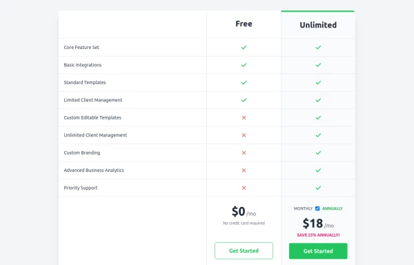 Comparison Pricing Table Component
A responsive pricing table built with HTML and Tailwind CSS, comparing two plans (Free and Unlimited) with a clear feature checklist. Includes distinct styling for the premium plan and a toggle for monthly/annual pricing display.
10 months ago1.4k -
 3 years ago8.9k
 -
 1 year ago880
 -
 1 year ago1.7k
 -
 10 months ago1.2k
 -
 1 year ago1.1k
 -
 CSS-Boy
Inspired by the Pip-Boy Model 3000 from Fallout: New Vegas. Comes with multiple pages and some animations. All decorative background elements disappear when the screen is <sm (it's responsive).
9 months ago888 -
 iPhone 15 Mockup
The "Screen Content" div can be manipulated to have anything inside the screen.
1 year ago1.6k -
 Modern Dark Footer with Overlapping Gradient CTA
A comprehensive, dark-themed website footer component built with HTML and Tailwind CSS. It features a visually distinct overlapping section with a colorful gradient background containing a prominent call-to-action (CTA) block. The main footer area utilizes a multi-column grid layout for organized navigation links, a newsletter signup form, and social media icons. A final bottom bar includes legal links and copyright information. The design is responsive and adapts its layout for different screen sizes.
10 months ago1.1k -
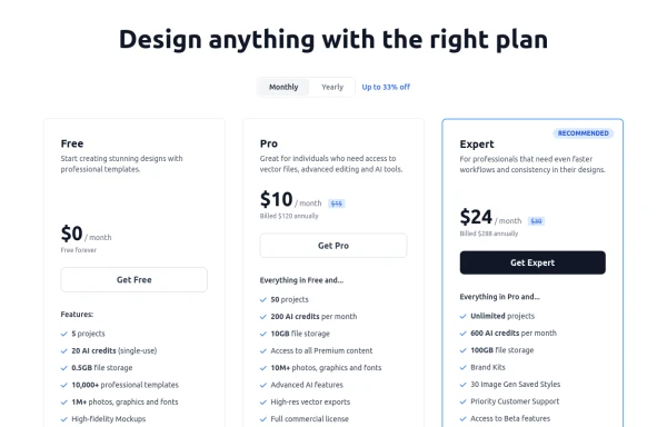 Modern Responsive Pricing Section with Toggle
A sleek, responsive pricing section built with HTML and Tailwind CSS, showcasing three distinct plans (e.g., Free, Pro, Expert) in a card layout. It features a clean monthly/yearly toggle switch with savings indication, highlights a recommended plan with distinct styling and a badge, and uses checkmarks for clear feature comparison. The layout stacks vertically on smaller screens and transitions to a 3-column grid on large screens (lg breakpoint). Includes generic content for easy adaptation and a final "Compare Plans" button.
10 months ago1.1k


Explore components by Tags
Didn't find component you were looking for?
Search from 3000+ components