CSS-Boy
Inspired by the Pip-Boy Model 3000 from Fallout: New Vegas. Comes with multiple pages and some animations. All decorative background elements disappear when the screen is <sm (it's responsive).
This tailwind example is contributed by Nick Girga, on 08-May-2025. Component is made with Tailwind CSS v3. It is responsive. similar terms for this example are simulation,copy,dummy,miniature,like

Author Nick Girga
Related Examples
-
 3 years ago8.9k
 -
 YouTube Community Post UI Mockup
A static HTML and Tailwind CSS component mimicking the user interface of a YouTube Community Post. This mockup features the channel header (avatar, name, verified badge, timestamp), post content (text and optional media), engagement actions (Like, Dislike, Comment, Share with counts), and the 'Add a comment' section. It's designed to be responsive, supports YouTube's light and dark themes via custom styling, and uses accurate iconography.
10 months ago1.2k -
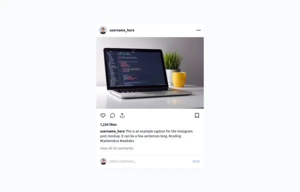 Instagram Post UI Mockup
A static HTML and Tailwind CSS component that visually replicates the user interface of an Instagram post. This mockup includes the post header (avatar, username, options), image area, action buttons (like, comment, share, save), like count, caption, and comment section. It features responsive constraints and supports both light and dark mode, closely mimicking the look and feel of the actual Instagram app. Ideal for UI prototyping, style guides, or frontend development practice.
10 months ago1.4k -
 11 months ago1.2k
 -
 6 months ago507
 -
 itskoti.com
ssdas
1 year ago1.3k -
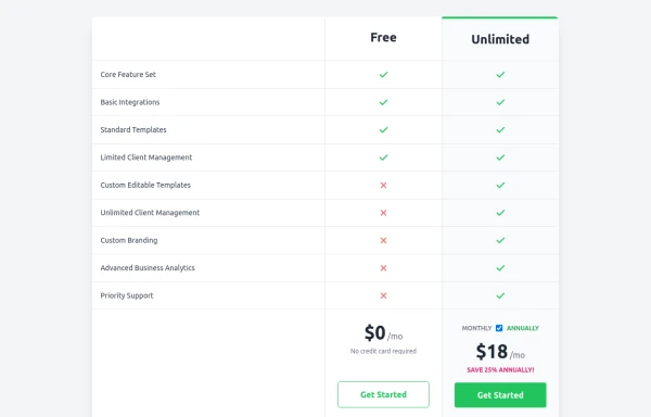 Comparison Pricing Table Component
A responsive pricing table built with HTML and Tailwind CSS, comparing two plans (Free and Unlimited) with a clear feature checklist. Includes distinct styling for the premium plan and a toggle for monthly/annual pricing display.
10 months ago1.5k -
 3 years ago10.6k
 -
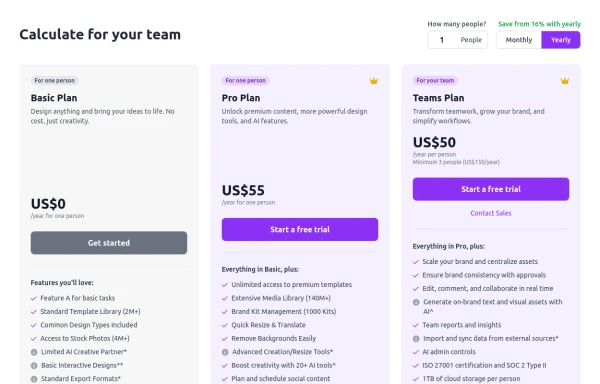 Configurable 3-Tier Responsive Pricing Table
A modern, responsive pricing table component inspired by SaaS layouts, built with HTML and Tailwind CSS. Features three distinct pricing tiers displayed in cards, stacking vertically on smaller screens and transitioning to a 3-column grid on large screens (lg breakpoint). Includes interactive top controls for selecting the number of users and toggling between monthly/yearly billing cycles. Each card uses placeholder content for icons, titles, descriptions, features (with checkmarks/info icons), and distinct call-to-action buttons, making it easily adaptable. Styled with subtle background colors and clear typography for excellent readability.
10 months ago872 -
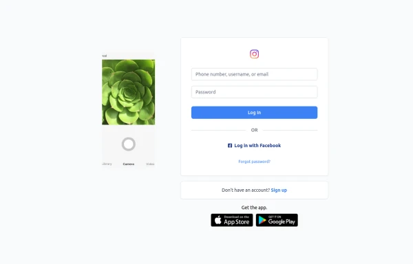 Best Log In page ever
Instagram look like but not copy right 🤗,best login and sign and even for many others
9 months ago907 -
 3 months ago293
 -
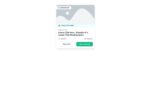 E-Learning Course Card with Badge and Level Indicator
An HTML and Tailwind CSS component mockup for displaying course information. Features include a placeholder image area with an overlaid certificate badge, a distinct level indicator banner below the image, category text, a course title, key details (like duration and learner count placeholders), and primary/secondary action buttons. Designed for e-learning platforms or course listings.
10 months ago1.1k


Explore components by Tags
Didn't find component you were looking for?
Search from 3000+ components