Overlapped icons showcase
Al pasar el cursor sobre el ícono apilado, se revela el ícono completo.
Hovering over the stacked icon unveils the complete icon.
This tailwind example is contributed by Lautaro Gómez, on 05-Aug-2024. Component is made with Tailwind CSS v3. It is responsive.

Author Lautaro Gómez
Related Examples
-
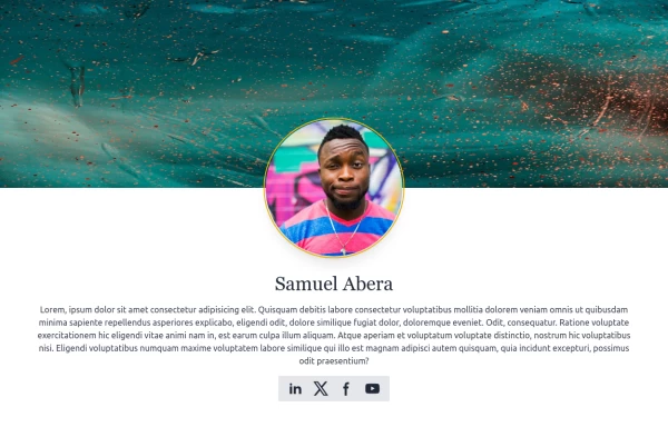 User Profile
User Profile
2 years ago5.7k -
 3 years ago11.9k
 -
 login page
login page
3 months ago299 -
 Avatar with activity indicator
online indicator pulse animation
3 years ago10.1k -
 3 years ago10.6k
 -
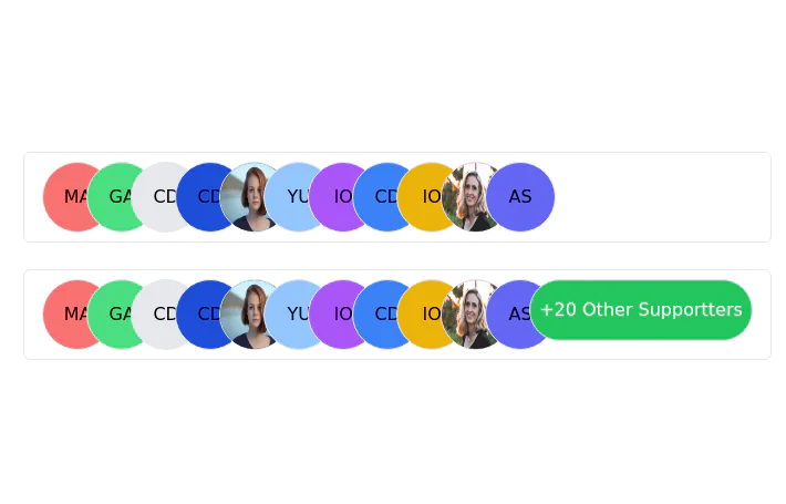 Stacked Profile
Stacked profile images
2 years ago7.6k -
 3 years ago9.6k
 -
 1 year ago1.6k
 -
 1 year ago1.6k
 -
 5 months ago341
 -
 Sponsors section
icon grid
3 years ago13.2k -
 User list
User list
9 months ago477


Explore components by Tags
Didn't find component you were looking for?
Search from 3000+ components