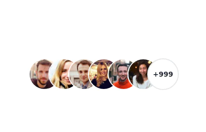
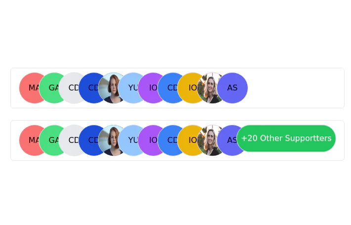
User avatar group
This tailwind example is contributed by Samuel Dawson, on 27-Jan-2023. Component is made with Tailwind CSS v3.

Author Samuel Dawson
Related Examples
-
 2 years ago14.8k
 -
 2 years ago9.6k
 -
 2 years ago11.7k
 -
 3 years ago9.9k
 -
 3 years ago11.5k
 -
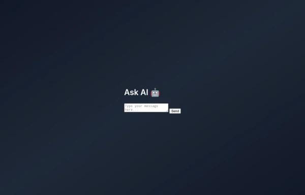 Clean AI Chat UI with Tailwind CSS – ChatGPT-Style Interface
A polished and responsive AI chat interface built using modern Web Components and Tailwind CSS. This UI replicates the smooth, minimal experience of ChatGPT with a clean layout, floating input bar, animated scrollable message feed, and mock AI responses. Ideal for SaaS dashboards, AI assistants, or frontend prototypes. Designed with professional spacing, accessible colors, and reusable components. Key features: Responsive layout with mobile support Floating input bar with auto-expanding textarea Tailwind-powered message bubbles with clear sender roles Modern dark theme with subtle gradients and shadows Easily extendable to real AI APIs (e.g., OpenAI)
6 months ago1.5k -
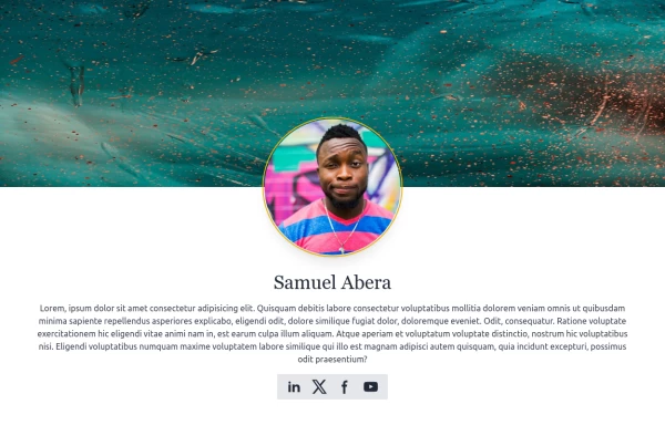 User Profile
User Profile
1 year ago5.5k -
 7 months ago1.7k
 -
 Profit Card
Profit card with deatils
1 year ago1.8k -
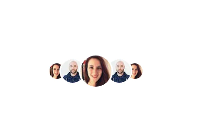
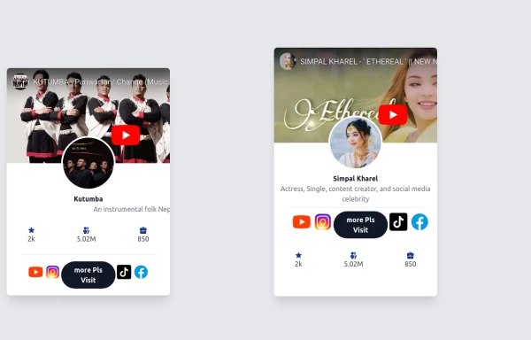
 Stacked Profile
Stacked profile images
2 years ago7.2k -
 canvas fully covers
canvas fully covers
6 months ago700 -
 5 months ago262


Explore components by Tags
Didn't find component you were looking for?
Search from 3000+ components