Logo cloud
This tailwind example is contributed by Alok, on 12-Mar-2023. Component is made with Tailwind CSS v3. It is responsive.

Author Alok
Related Examples
-
 Sponsors section
icon grid
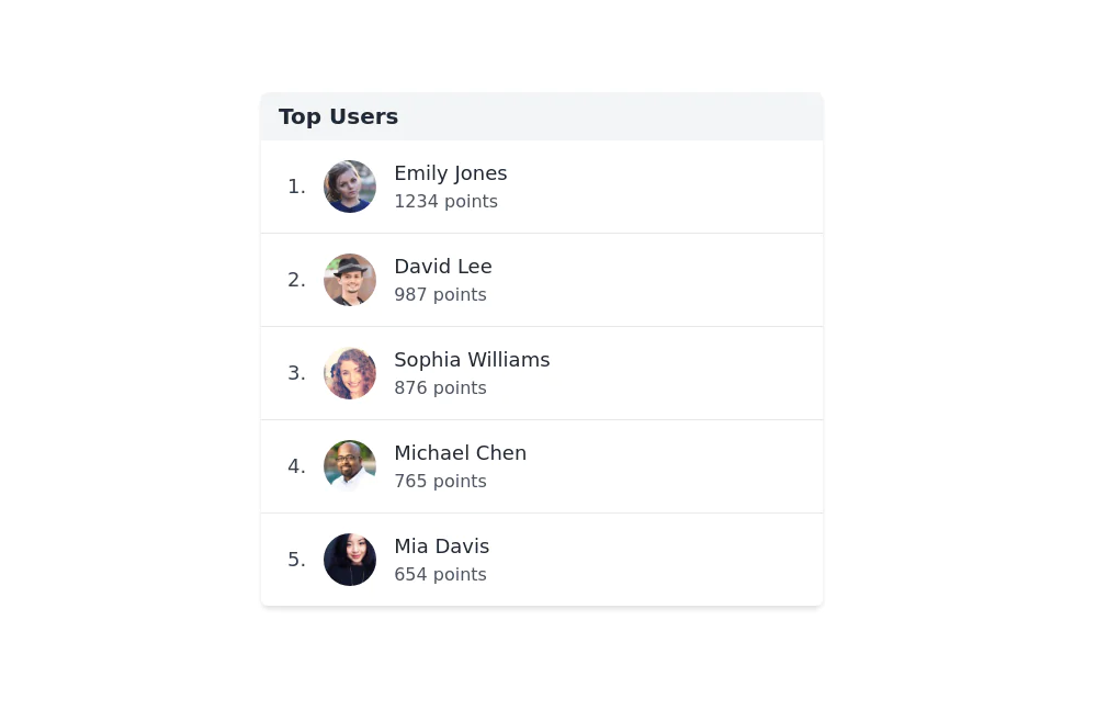
3 years ago13.2k -
 2 years ago13.1k
 -
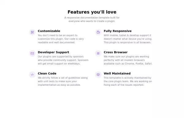
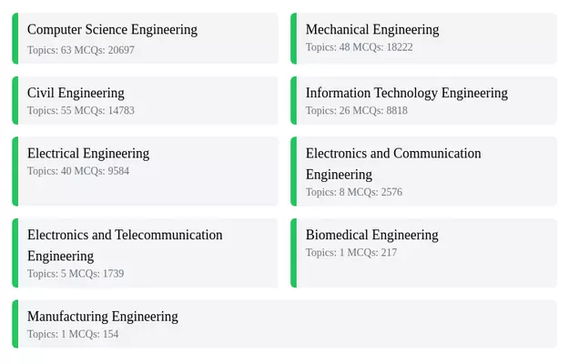
 Responsive Card Grid
Tailwind CSS responsive grid for feature listing. The cards have a teal background, rounded corners, and a concise display of feature titles, descriptions, and a "Learn More" link.
3 years ago52.4k -
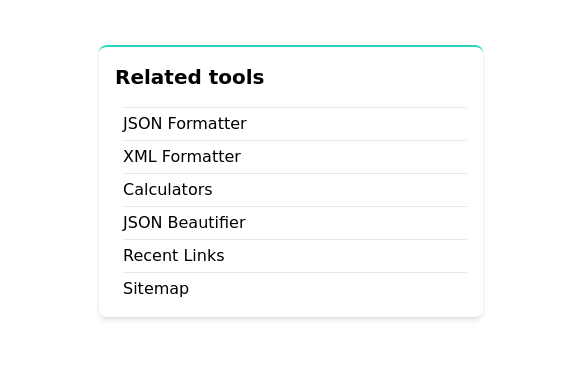
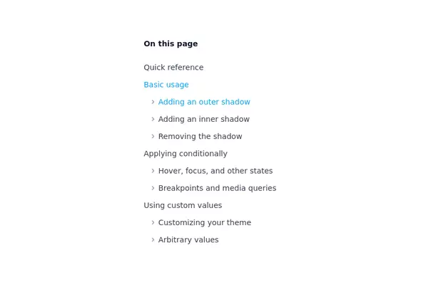 Nested list
A nested list is suitable for a table of contents / navigational list
3 years ago21.4k -
 3 years ago19k
 -
 3 years ago10.5k
 -
 2 years ago14.5k
 -
 3 years ago16.4k
 -
 3 years ago10.3k
 -
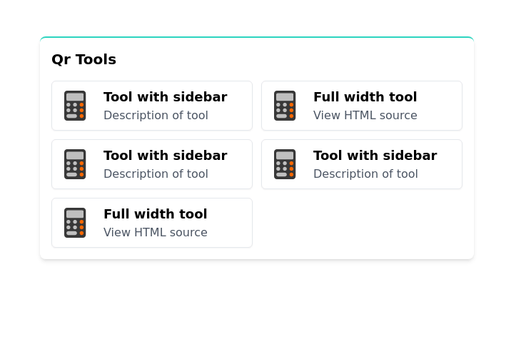
 About our apps UI Components
A visual collection of our most recent works - each piece crafted with intention, emotion and style.
1 month ago170 -
 3 years ago13.7k
 -
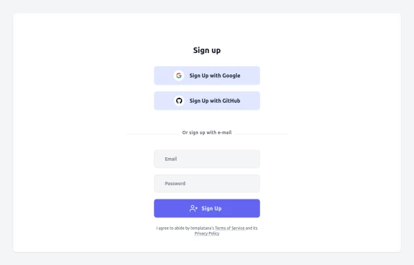 Login Form
Login Form With google icon
1 year ago1.9k


Explore components by Tags
Didn't find component you were looking for?
Search from 3000+ components