- Home
-
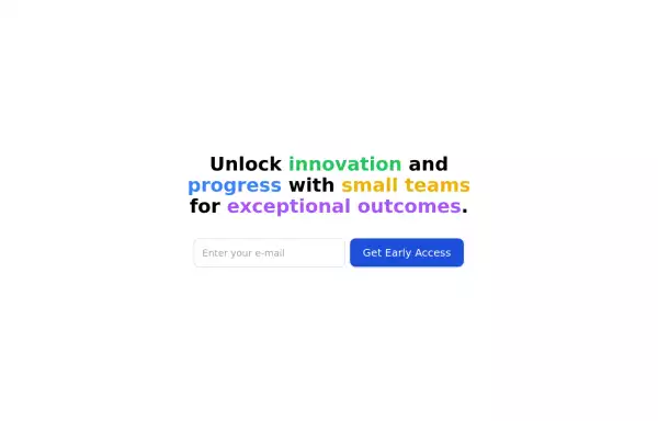
CTA banner
CTA banner
With fading bg gradient
This tailwind example is contributed by Lautaro Gómez, on 05-Aug-2024. Component is made with Tailwind CSS v3. It is responsive. It supports dark mode. similar terms for this example are CTA,banner
Author Lautaro Gómez
Related Examples
-
3 years ago11.7k
-
gaming profile.
gaming profile.
6 months ago647 -
Registration Form with Validation & Success State
A modern and interactive registration form built using Tailwind CSS and Alpine.js, designed for seamless user onboarding with real-time validation and elegant animations. This component includes client-side form validation, dynamic password visibility toggles, and a success confirmation screen with personalized feedback. It’s fully responsive, dark mode–ready, and styled for modern SaaS or startup platforms. ✨ Key Features 🧠 Real-time input validation for required fields (name, email, password, etc.) 🔒 Show/hide password toggle with animated SVG icons ✅ Success message with user details after submission 💨 Animated transitions using Alpine.js 🌙 Dark mode and light mode compatible 📱 Fully responsive across all screen sizes 🧩 Built with pure Tailwind CSS and Alpine.js (no external libraries) 💡 Perfect for: Registration or sign-up pages SaaS onboarding flows Portfolio or agency login systems Form validation demos or UI component libraries
5 months ago290 -
2 years ago5k
-
Modern Dark Footer with Overlapping Gradient CTA
A comprehensive, dark-themed website footer component built with HTML and Tailwind CSS. It features a visually distinct overlapping section with a colorful gradient background containing a prominent call-to-action (CTA) block. The main footer area utilizes a multi-column grid layout for organized navigation links, a newsletter signup form, and social media icons. A final bottom bar includes legal links and copyright information. The design is responsive and adapts its layout for different screen sizes.
10 months ago1.1k -
3 years ago9.6k
-
Hero section with a gradient background
With text overlay, and a call-to-action button
2 years ago20.3k -
Call to action
CTA
1 year ago1.9k -
1 year ago1.9k
-
Beautiful CTA w/ large buttons
This CTA card also has a features list
2 years ago2.6k -
2 years ago14.1k
-
Call to action
slightly tilted call to action section
3 years ago11.3k
Explore components by Tags
Didn't find component you were looking for?
Search from 3000+ components
